Wally is the new corporate type for Wallapop, the successful Spanish buying-and-selling app used by millions of people around the world. The type responds to the brief's triple challenge: establish a formal relationship with the corporate logotype, express the brand's essential values, and ensure excellent functionality regardless of where the app is viewed. We designed Wally based on the logotype's most distinctive formal elements: its explicitly round structure and the links between letters. In the new type, this translates into a generous use of "gestural" terminals that reflect this characteristic. In its texture and details, Wally expresses the values that the brief defined as the Wallapop identity: diverse, friendly, likeable, open and accessible. The family has three weights and is specifically tailored to the technical requirements of the app. The use of features (programming) makes it possible to exchange glyphs in certain character combinations, which helps adjust the stress between the geometry of the structure and the humanist expression of the terminals. It also gives the typeface an iconoclastic identity and a dynamic, functional texture. These features are a tribute to the undisputed icon among geometric types: Futura by Paul Renner. As a nod to the brand identity, whenever the w meets the a, it transforms into the logotype's characteristic w.


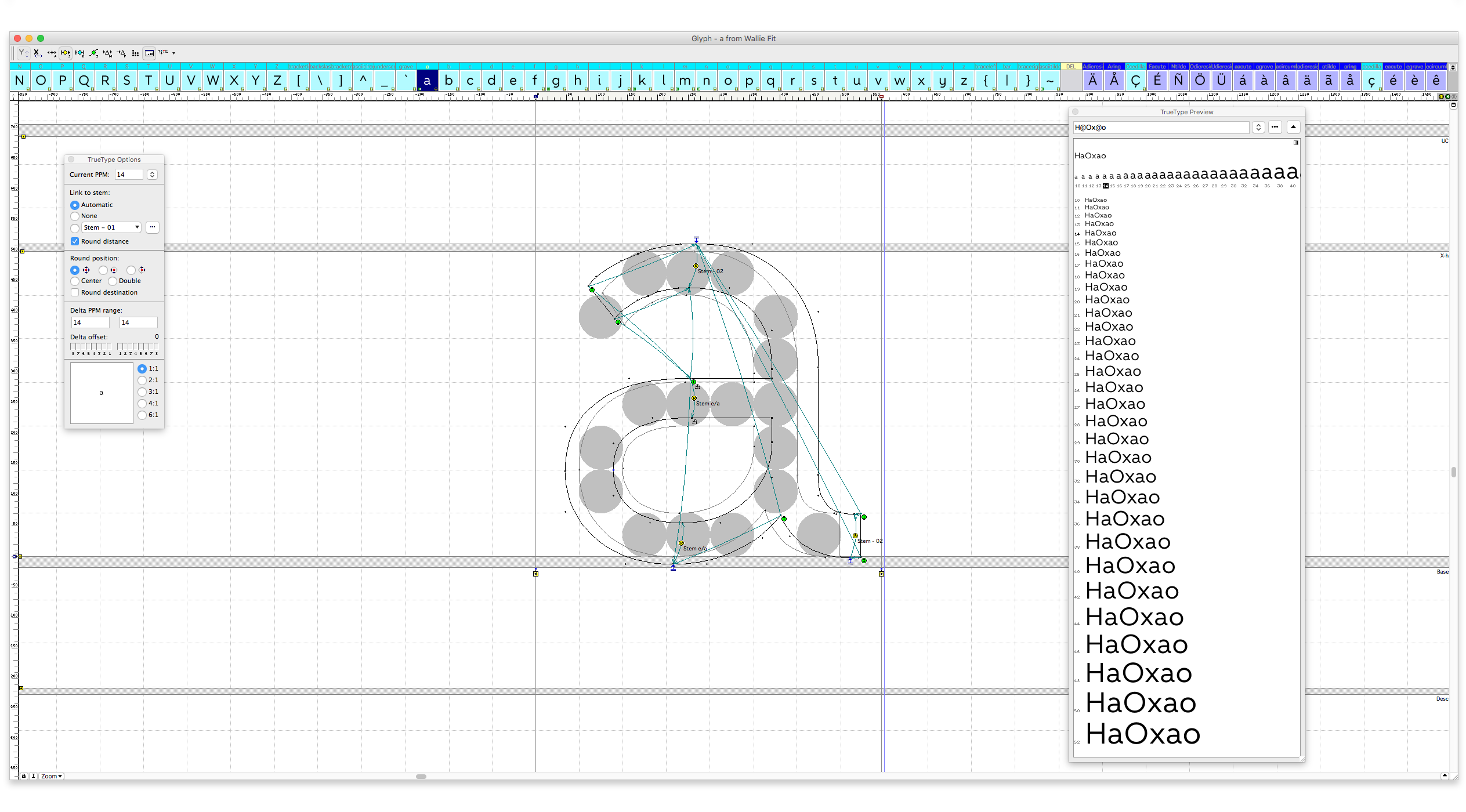
In order to ensure proper cross-device visualization, we developed customized hints in collaboration with Noe Blanco, which allows for optimal adjustments in low-resolution devices. We defined the typeface's key formal aspects –proportion, thickness, contrast, etc.– based on these technical restrictions.