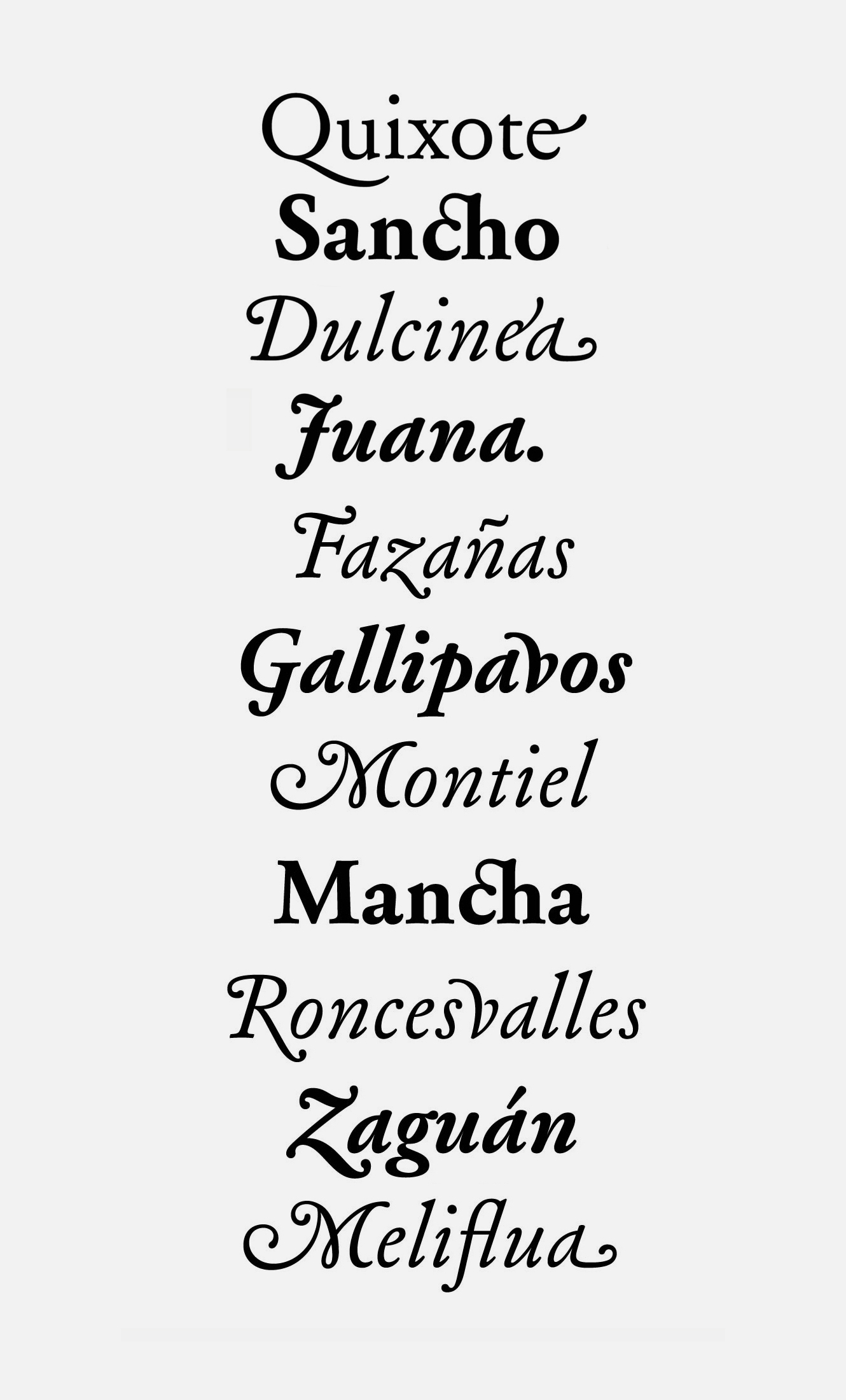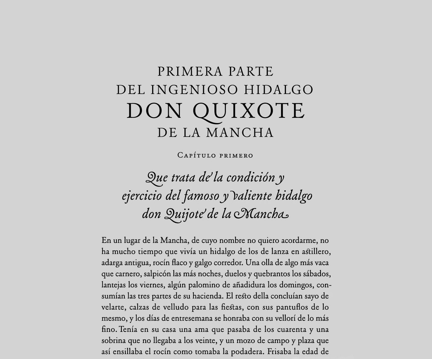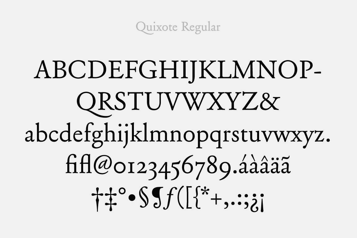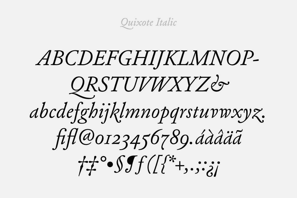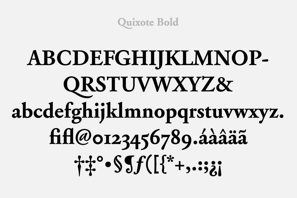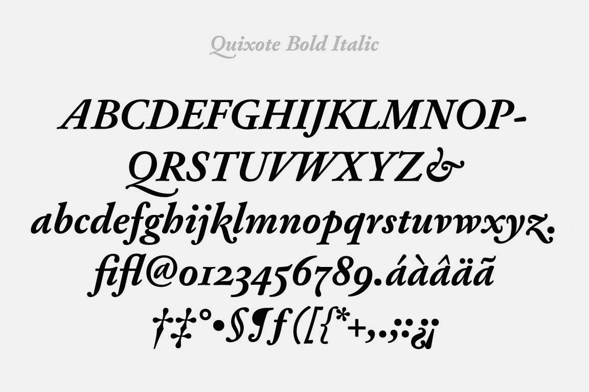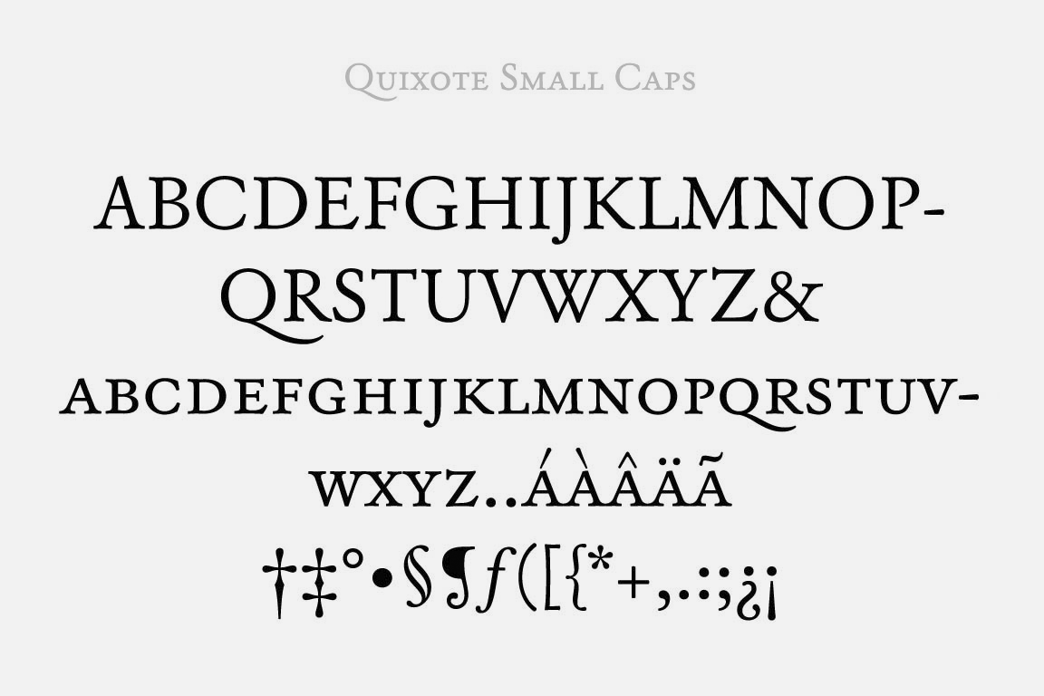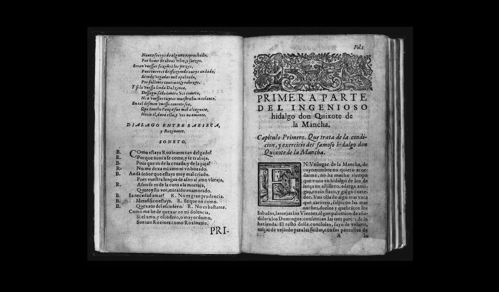

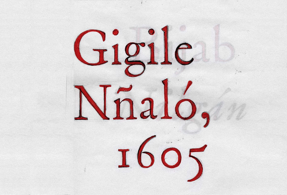
Quixote won the contest held by the Autonomous Community of Castilla La Mancha in 2005 in celebration of the 4th Don Quixote Centennial. The competition sought a new typeface for future editions of Cervantes's masterpiece. The project also received an Excellence in Type Design award from the Type Directors Club of New York in 2006. Quixote is inspired by the unique typographic attributes found in the first edition of Don Quixote, printed by Juan de la Cuesta in 1605. From there, it became a reinterpretation of the spirit of seventeenth-century Baroque typographic tradition. Quixote is specifically designed for the composition of classic books.
Why this typeface in particular?
This isn’t the typeface of Don Quixote. It is the typeface we would like Don Quixote to inhabit. The project takes inspiration from the first edition of Don Quixote, printed in 1605 by Juan de la Cuesta, but it isn’t an archaeological endeavor that tries to improve on the original edition through digital means. The aim of this alphabet is to create a new tool that captures and expresses the style of Don Quixote as a way of conveying the spirit of Cervantes's novel to contemporary readers. We interpreted this idea freely, taking license with certain elements that aren't strictly seventeenth century, such as the exaggeration of certain forms, the inclusion of new glyphs, and the introduction of a bold font. In other words, it is not a historically faithful rendering, even though it reflects details and distinctive attributes reminiscent of the original typefaces. The project was conceived as a tribute to one of the masterpieces of world literature with a typeface specifically designed to compose a new edition of The Ingenious Nobleman Sir Quixote of La Mancha. That was its sole purpose.


Why a Baroque typeface?
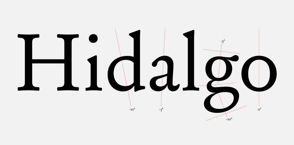
We probably don't need more types. But in any case, what use is a type like this in the twenty-first century? From a linear historical perspective, and compared to Garalde or Renaissance style, Baroque typography stands out for its accentuated interplay of irregular axes and contrasts that really bring a text to life. Among other virtues, Baroque typefaces have proven well suited to long reads. Baroque letters seem individually designed; every character has its own personality. And yet in the composition of the words, the units that determine readability, every element is in its place and fulfils its function. This apparent incoherence becomes a virtue, because it draws words of great personality, offering the eye a harmonious and highly functional "gray".
In building this alphabet, we reinterpreted certain aspects of the period's printed materials, but without imitating their technical imperfections. Generally speaking, digital versions of traditional type tend to emphasize contrast. In other words, they enhance the difference between horizontal and vertical strokes. This is probably due to the commercial necessity of adapting typefaces to contemporary tastes and using a single model to resolve the infinite number of sizes made possible by digital technology. Furthermore, these versions are rarely printed in metal and almost always use different techniques than their seventeenth-century counterparts. The resulting body text is lighter, more contrasted in appearance, thus losing many of the original advantages.
This new typeface, specifically designed for body text, features less contrast than most Baroque reinterpretations, both in the transitions from thicks to thins and in the junctions between strokes and serifs. This optimizes adjustments for readability, reinforced by a complementary version designed for use in display lines. The striking affectation of the terminals and the design of alternative characters also give the text personality and dynamism, crafting personality-driven words that are eminently legible. All of this, plus the texture of the letter contours, which emulates the tone of the original 1605 Quixote text, justifies the existence of this new alphabet.
Why is this the typeface of Don Quixote?
The formal and structural contradictions of Baroque type, and the expressive differences between the Roman and italic styles are a subtle reflection of the madness of Cervantes's famous character. Reason and madness coexist in Don Quixote, much like Baroque typography also has two sides to it. The bold font is Sancho Panza, the mundane, simple, straightforward and sincere counterpoint. We cannot understand a letter as Roman without the contrast of italic or bold, much like we cannot understand Quixote without Sancho, and Sancho without Quixote. Roman, italic, and bold communicate with each other, one justifying the existence of the other.
We never set out to create a faithful rendering of the Quixote type, because this would mean relegating the book to the past – a book that has become a classic, with all the authority and modernity that such a status entails. The alphabet's finish shows an appreciation for technical excellence, both in defining the letterform – geometric contours of arcs and straight strokes without texture – and in the kerning of certain pairs of letters. In addition, OpenType technology made it possible to include alternate characters. The bold, display, small caps, and sans serif versions are aimed at applications that place this project even more firmly in a present context. This typeface isn't meant for traditional designs; it is an alphabet for the twenty-first century, comprising elements of the seventeenth, but thoroughly modern.
Is it Spanish? There is no such thing as a Spanish typeface. It has never existed, and this alphabet doesn't aspire to invent it. The Spanish master printers of Cervantes's era almost always imported their bodkins, matrices, and types from countries with a stronger typographic tradition, like Holland or France, or copied their models. Some notable milestones do exist in Spanish typography, and there have been multiple attempts at finding a supposed Spanish style based on specific details. This new typeface doesn't seek out Spanish forms; it doesn't display any of the distinctive characteristics that would normally be considered typically Spanish. This collection of glyphs refers to a specific written document and attempts to recapture, in the here and now, a spirit, an idea, and an era.
