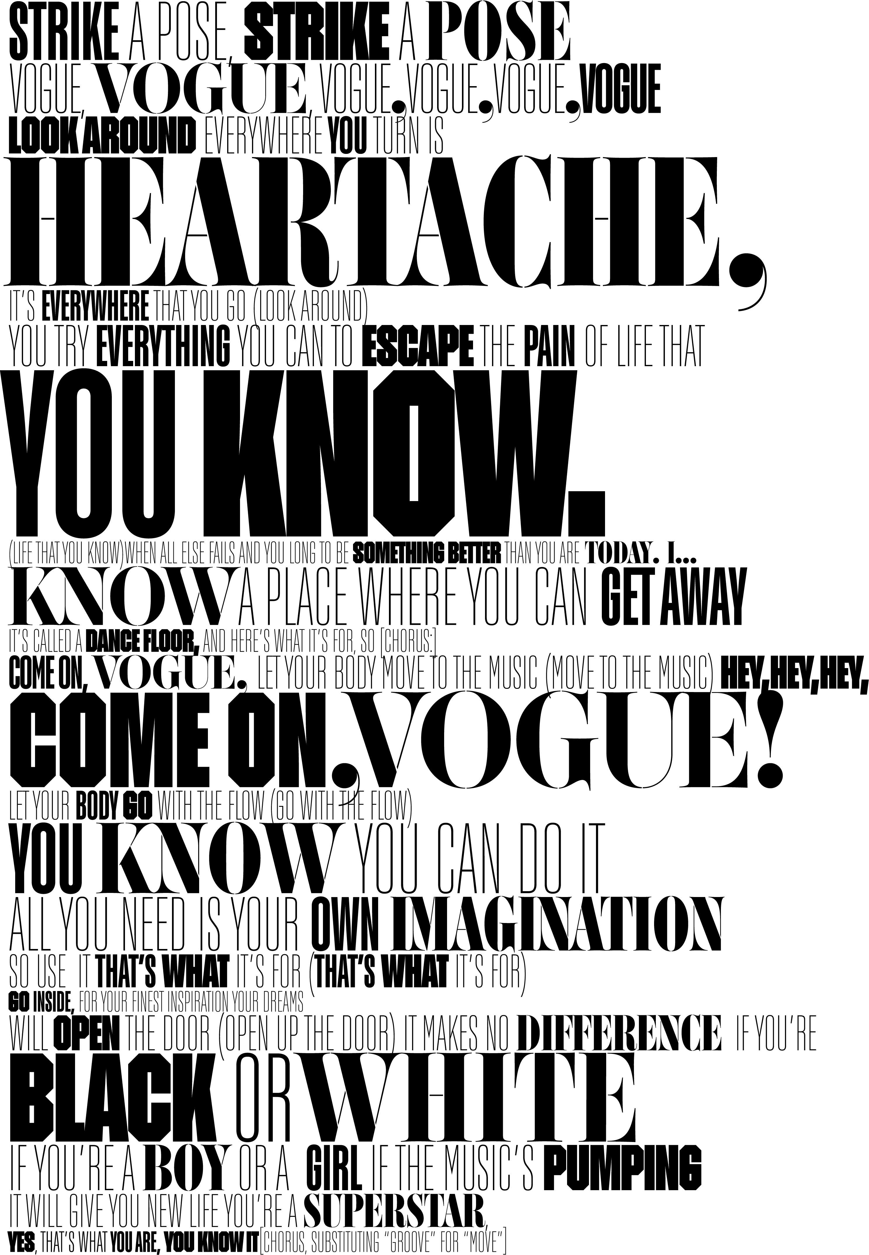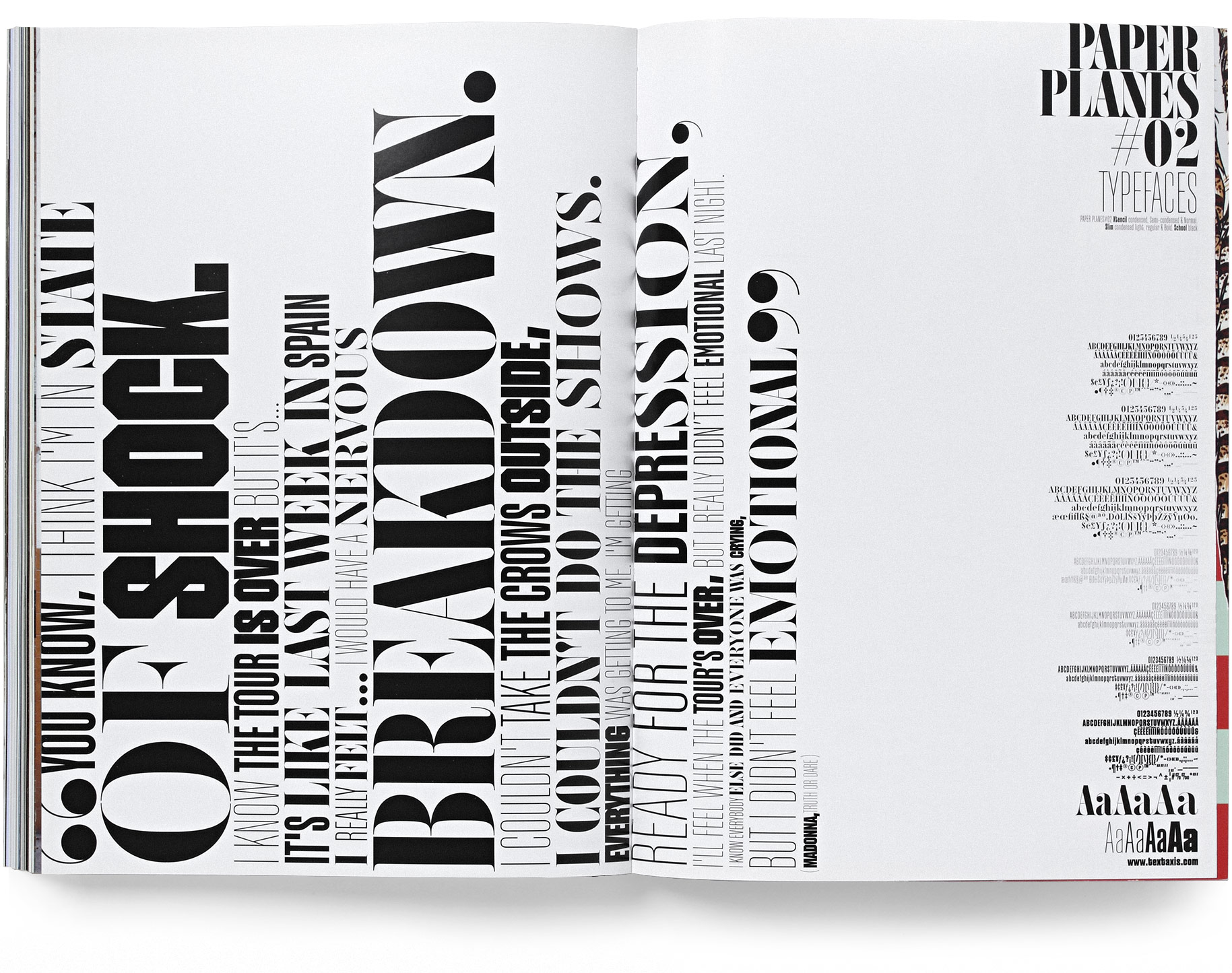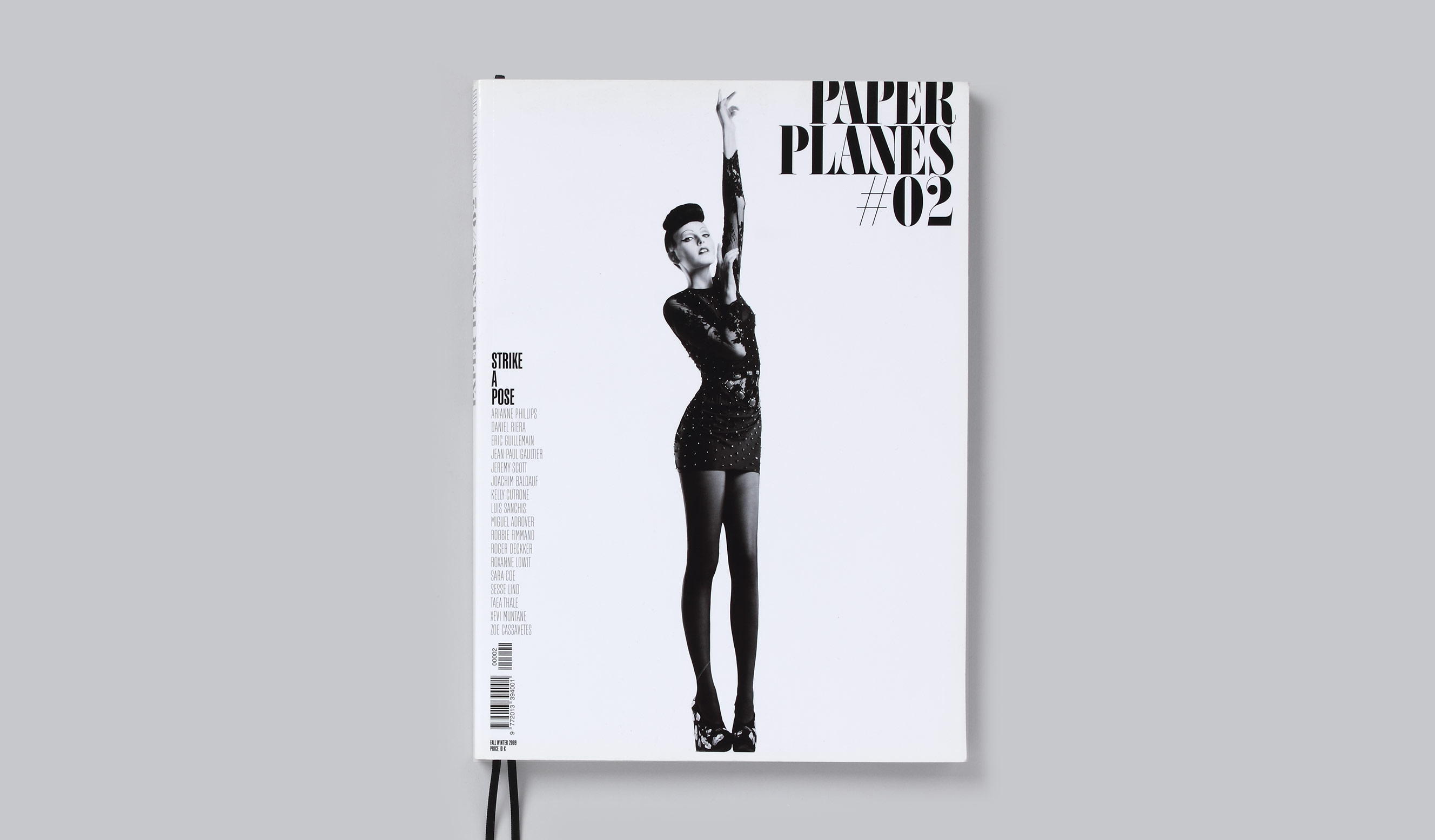
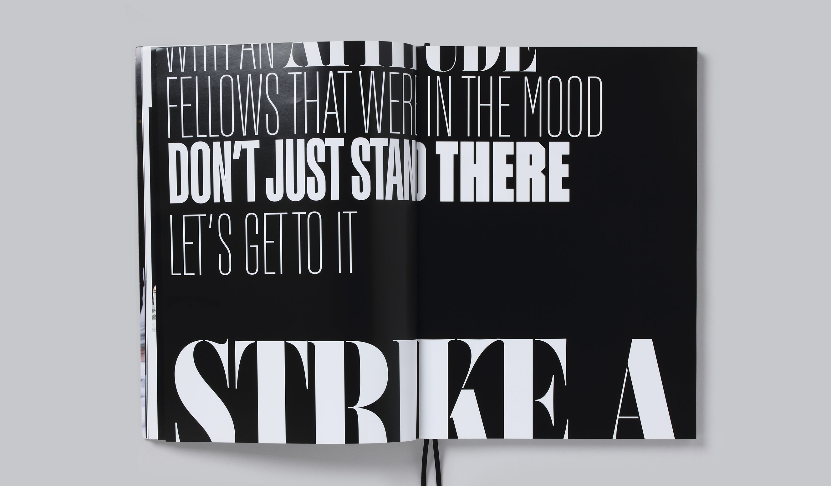
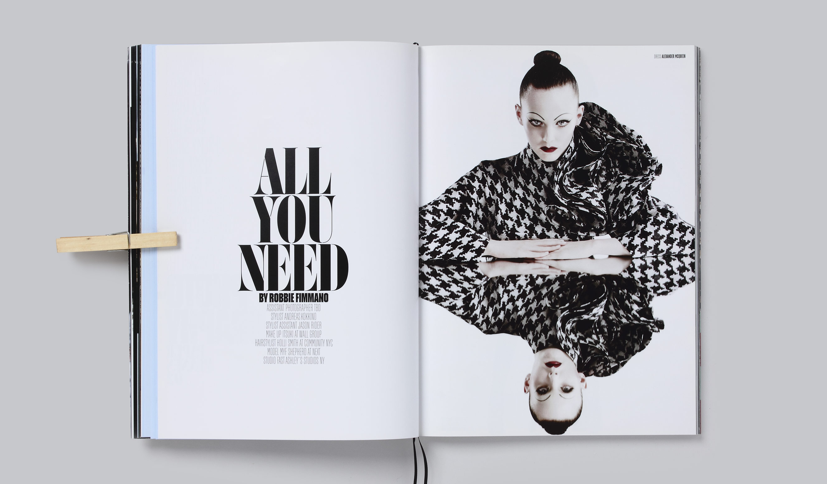
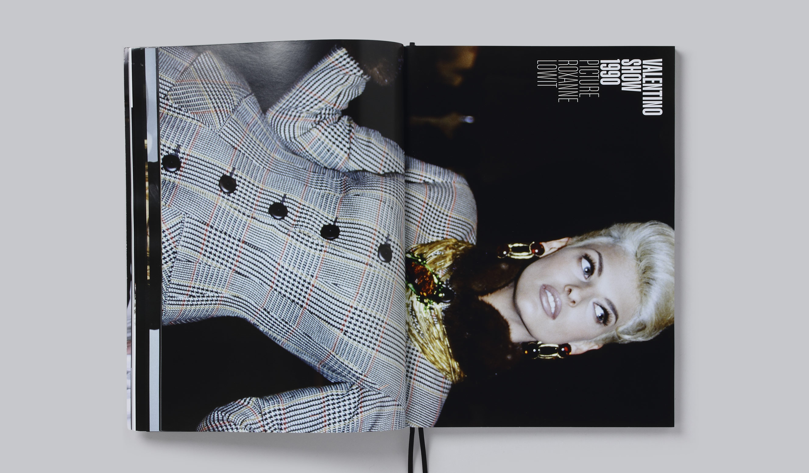
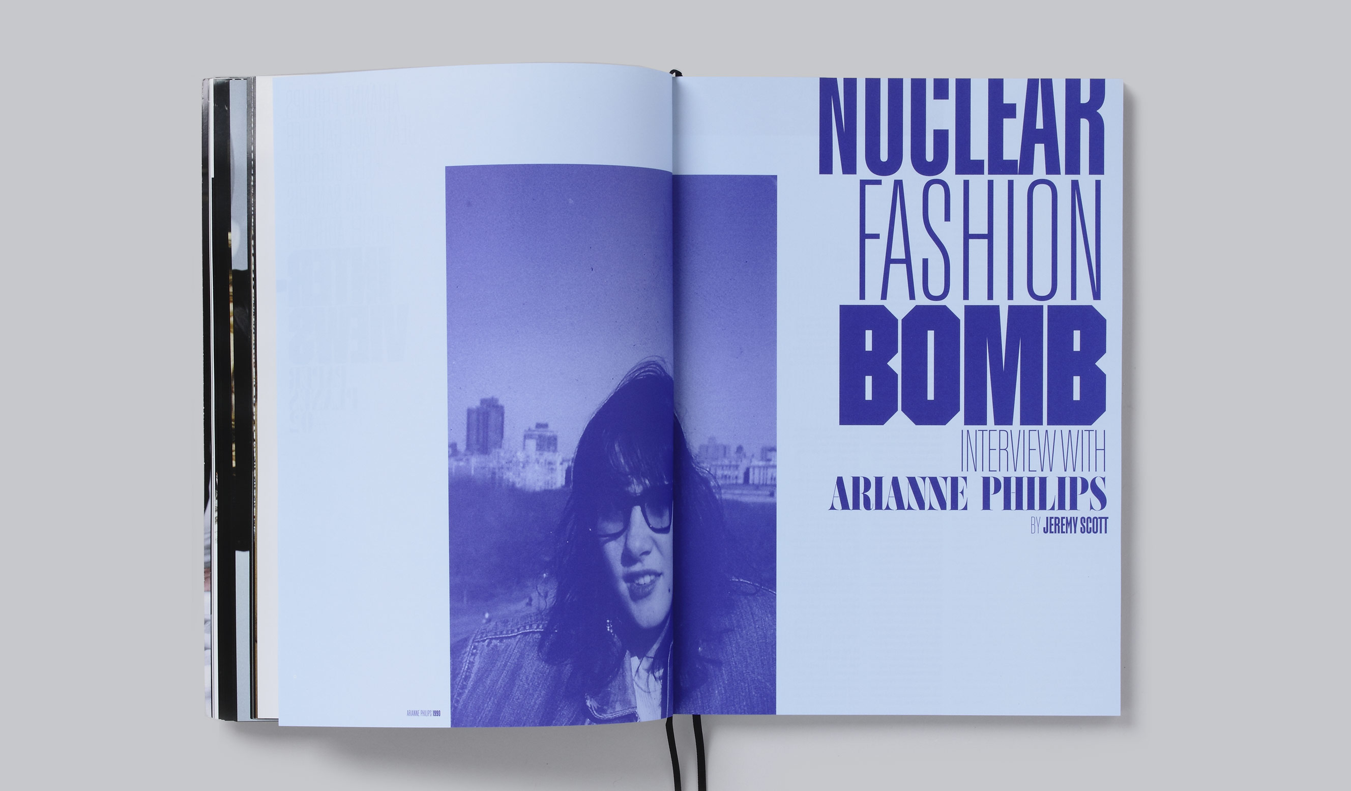
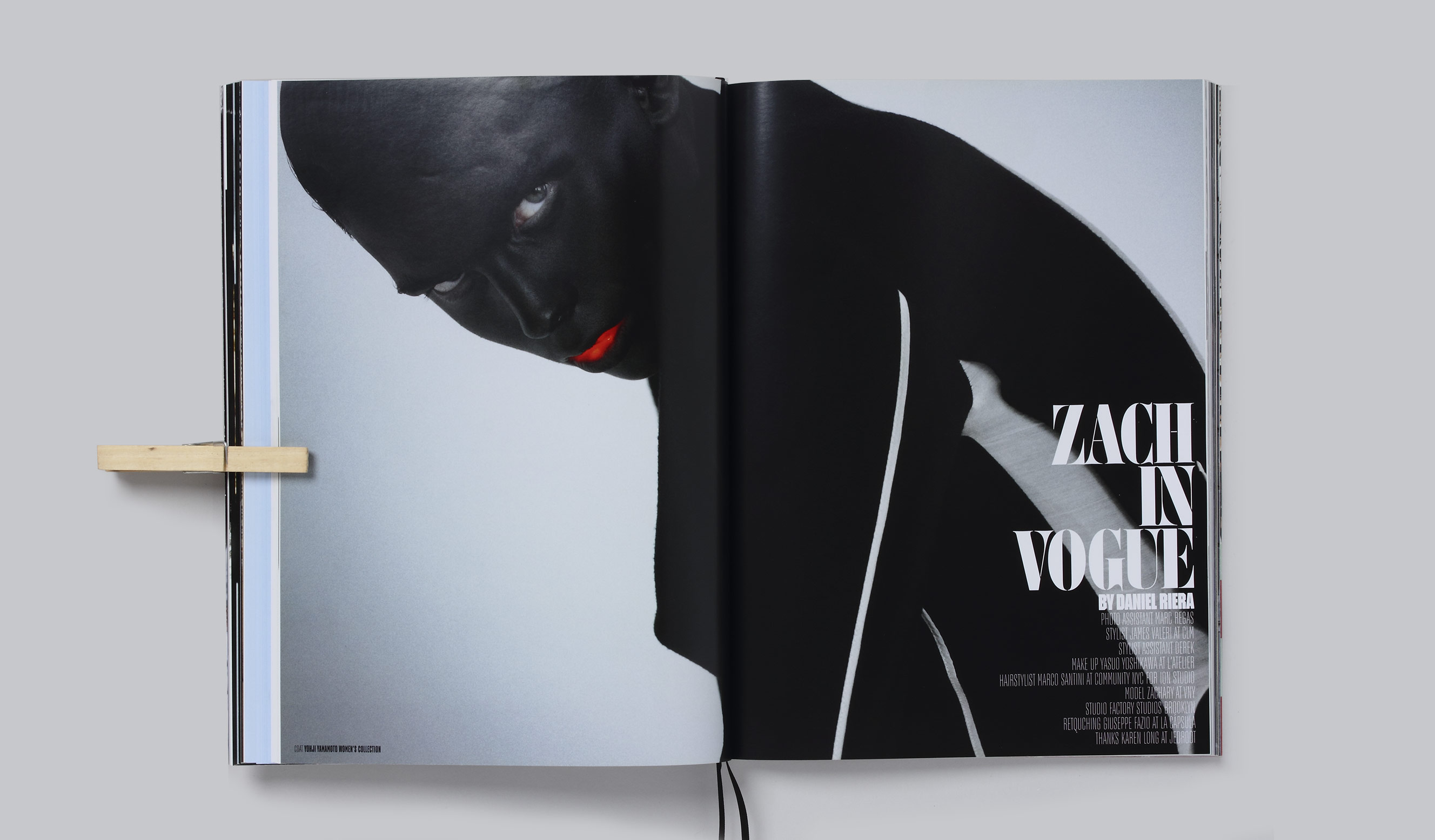
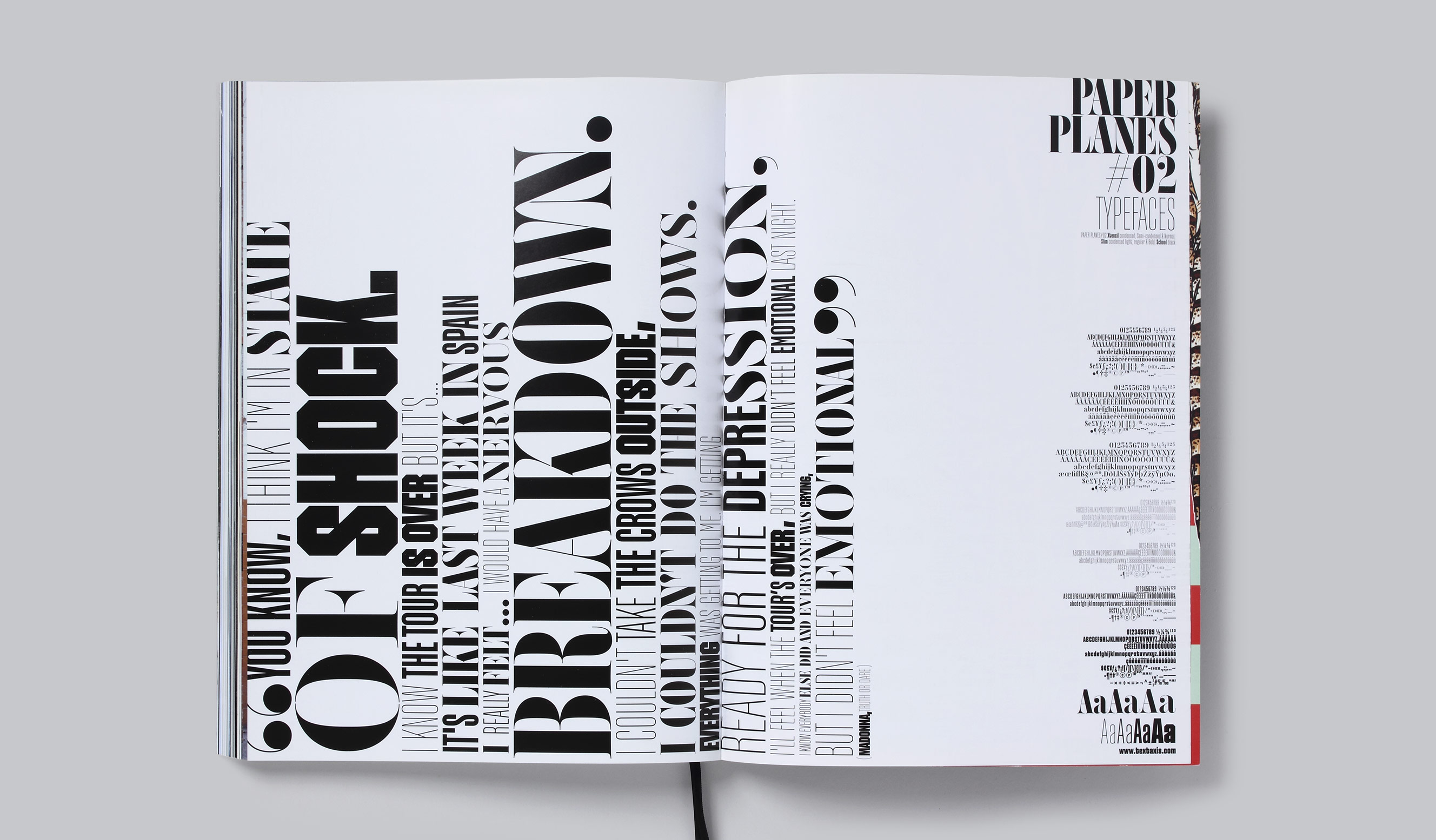
We designed a set of seven type variations for the second issue of the magazine Paper Planes, dedicated to Madonna's song «Strike a Pose» (1990) and voguing, a stylized modern form of house dance popularized in the 1980s with roots in Harlem's ball culture. The project became a typographic tribute to New York, the birthplace of voguing and an essential reference in the world of fashion. This stencil Didone typeface with three degrees of condensation is a direct nod to the iconic masthead of Vogue magazine. Complementing the set are three weights of a condensed sans serif, inspired by the first advertising lineales of the nineteenth century, which add to the vertical stress and create a strong formal contrast. The set also includes an extra-black weight of a condensed, university-style typeface. For this project, we designed the types based on the editor’s brief, and they became a tool to reinforce the vertical stress of the graphic concept that defines the magazine's layout.