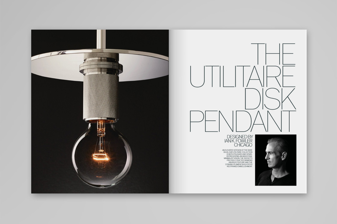
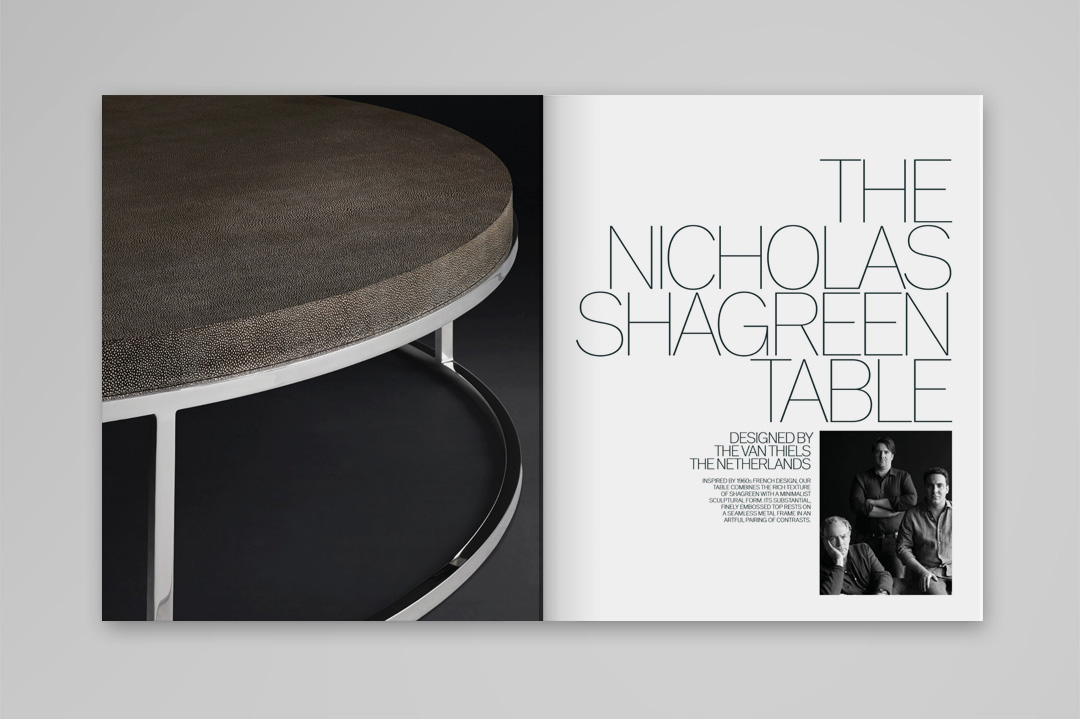
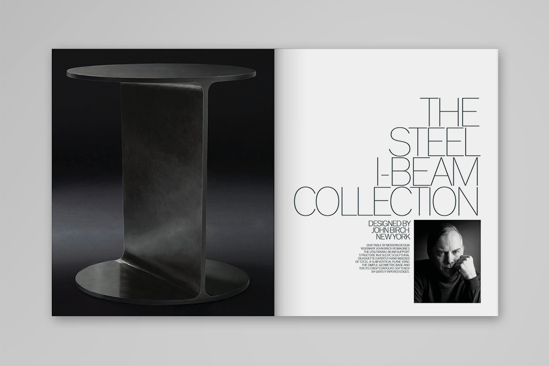
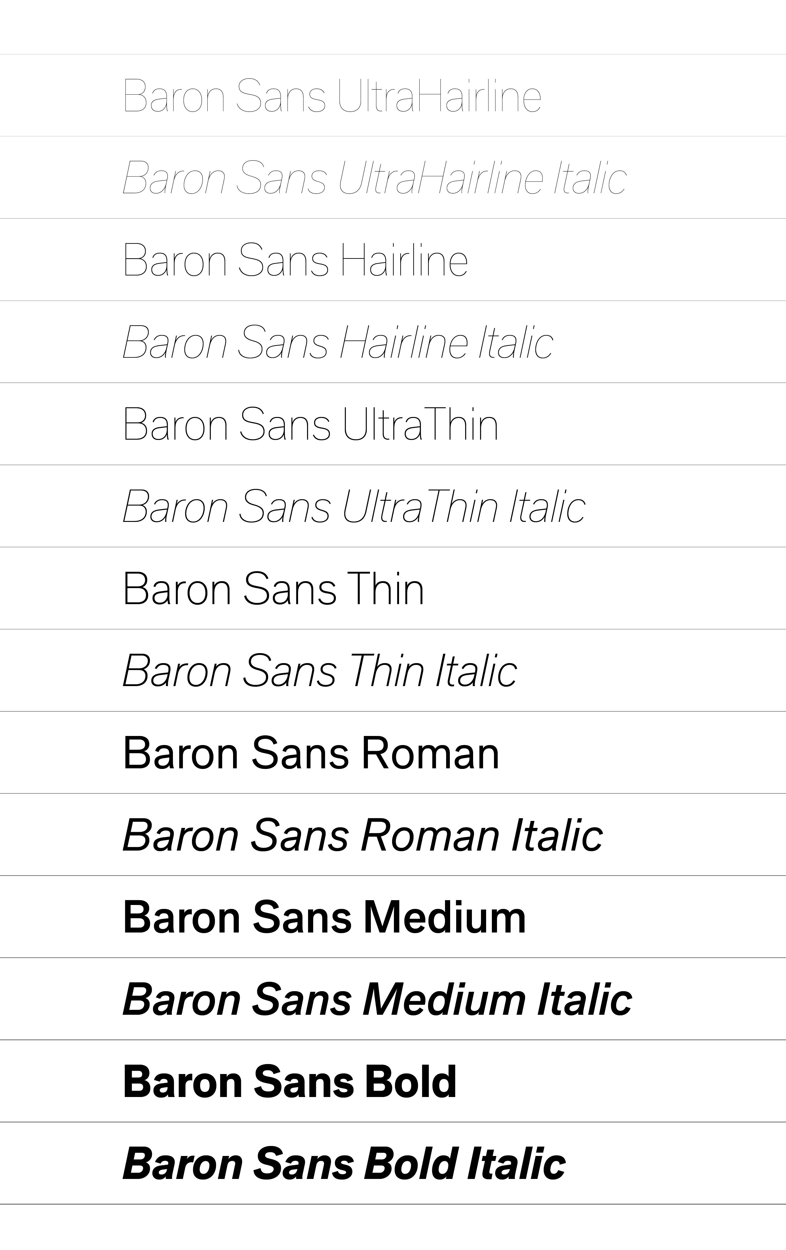
Quite possibly one of the «finest» typefaces in the world. The prestigious New York studio Baron&Baron commissioned us to completely revamp the old Baron Sans and adapt it as the corporate typeface for RH Modern, a product line of the American furniture design company Restoration Hardware. The project involved a precise, meticulous redrawing of every character and adjustments to create a display type in keeping with the graphic concept that Baron&Baron had defined for RH Modern. The family comprises seven weights with their companion italics. Baron Sans is inspired by the early grotesques of the twentieth century and builds on slightly condensed proportions that are accentuated as the weight decreases. We adapted the condensation, spacing, and contrast for each weight, focusing on large-format applications. Taking Baron Sans one step further as a display type, we developed a «skeleton» version, distilling its structure as a wireframe vector, a design that can be edited and composed in any graphic editor and supports the use of the lightest weight imaginable. This project was developed in partnership with José Manuel Urós.