From a strict, traditionalist, or simply classical standpoint, we could consider display types inspired by nineteenth-century Didones as caricatures, aberrations that offer a comical and forced interpretation of what many deem the culmination of typographic refinement: the romantic standards defined by Bodoni in Italy and Didot in France. But there is another way of seeing these commercial caricatures, the result of typography's release from its publishing corset: you can fall in love with them, letting go of all biases, and looking at them as paradigmatic and contradictory examples of the battle between ultimate expressiveness and traditional exactitude.
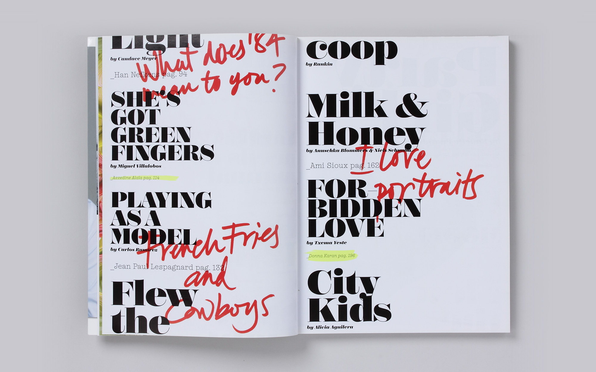
Poster & Monster is a contemporary interpretation of the Didone types of the nineteenth century, specifically designed for the first edition of the magazine Paper Planes. The graphic concept of the publication is inspired by the song «Forever Young» and uses the typical high school binder to symbolize a repository of intimate and special moments. This concept is expressed through the use of calligraphy, a graphic representation of the editor's notes and reflections. As a way of underscoring the youthful character of the publication, we designed Point types, a personal take on the American typewriter, and Poster & Monster in display and super-display styles. You can purchase Poster & Moster here!