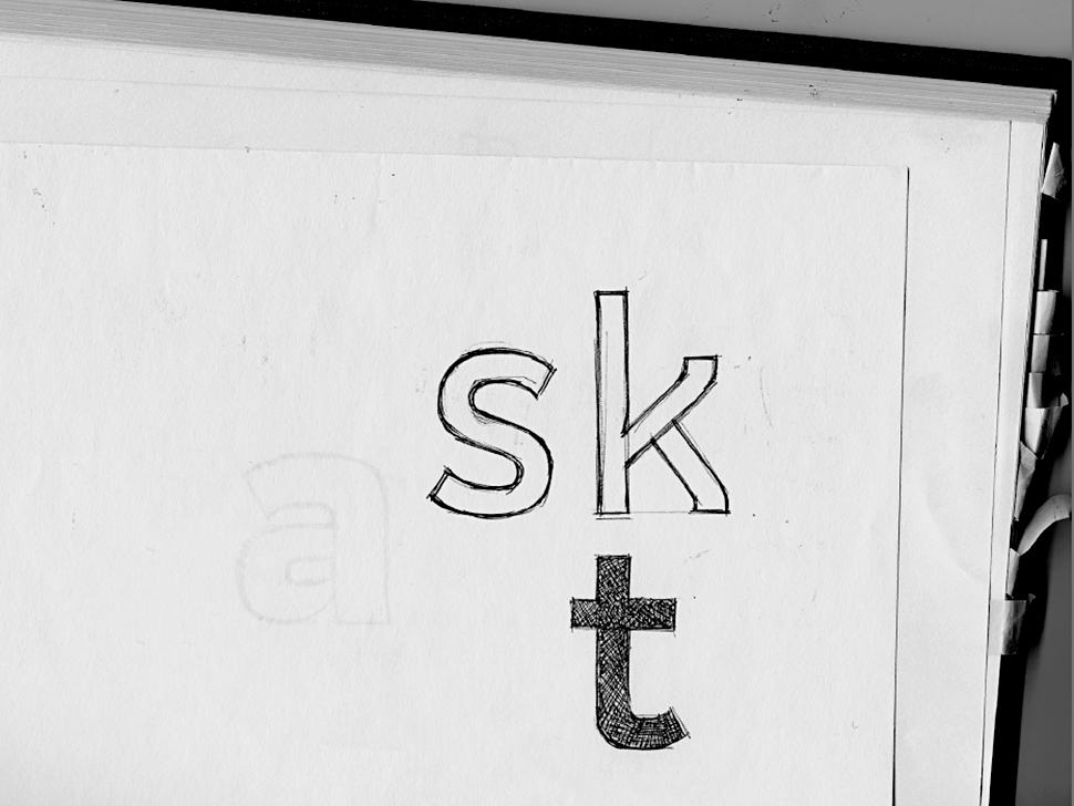
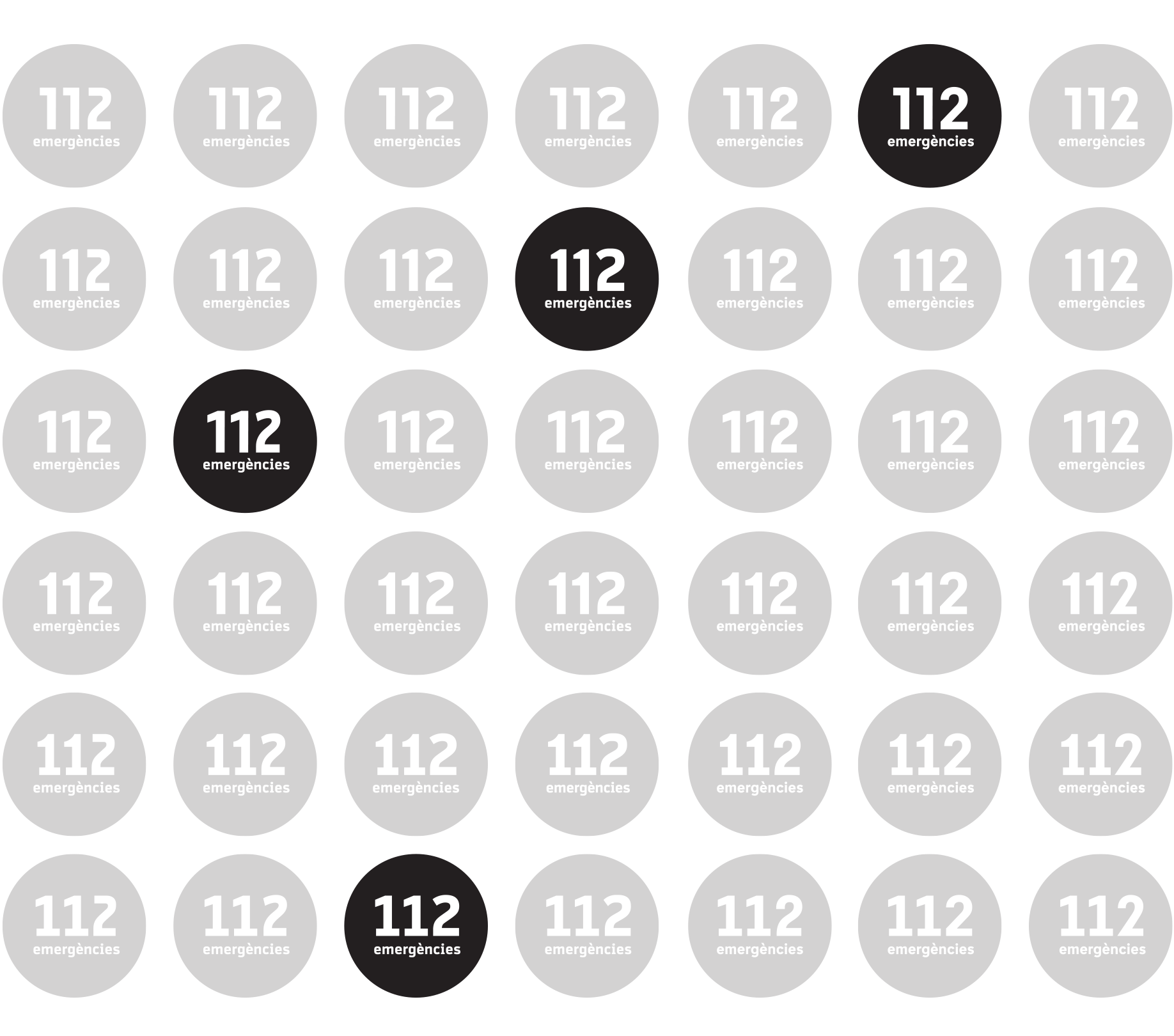
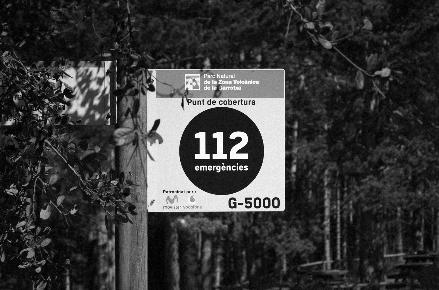
Brand lettering and type design for the corporate identity developed by Clase for the Generalitat de Catalunya's 112 emergency service The brief asked for a logotype and a corporate typeface with a clinical aesthetic and technological overtones. In addition to conveying functionality and efficiency, it had to facilitate the coordination of the graphic identity in this new stage of the service. During the research phase, we explored and developed different type structures and worked on adapting them to the formal requirements of a symbol while also distilling them into a typeface.

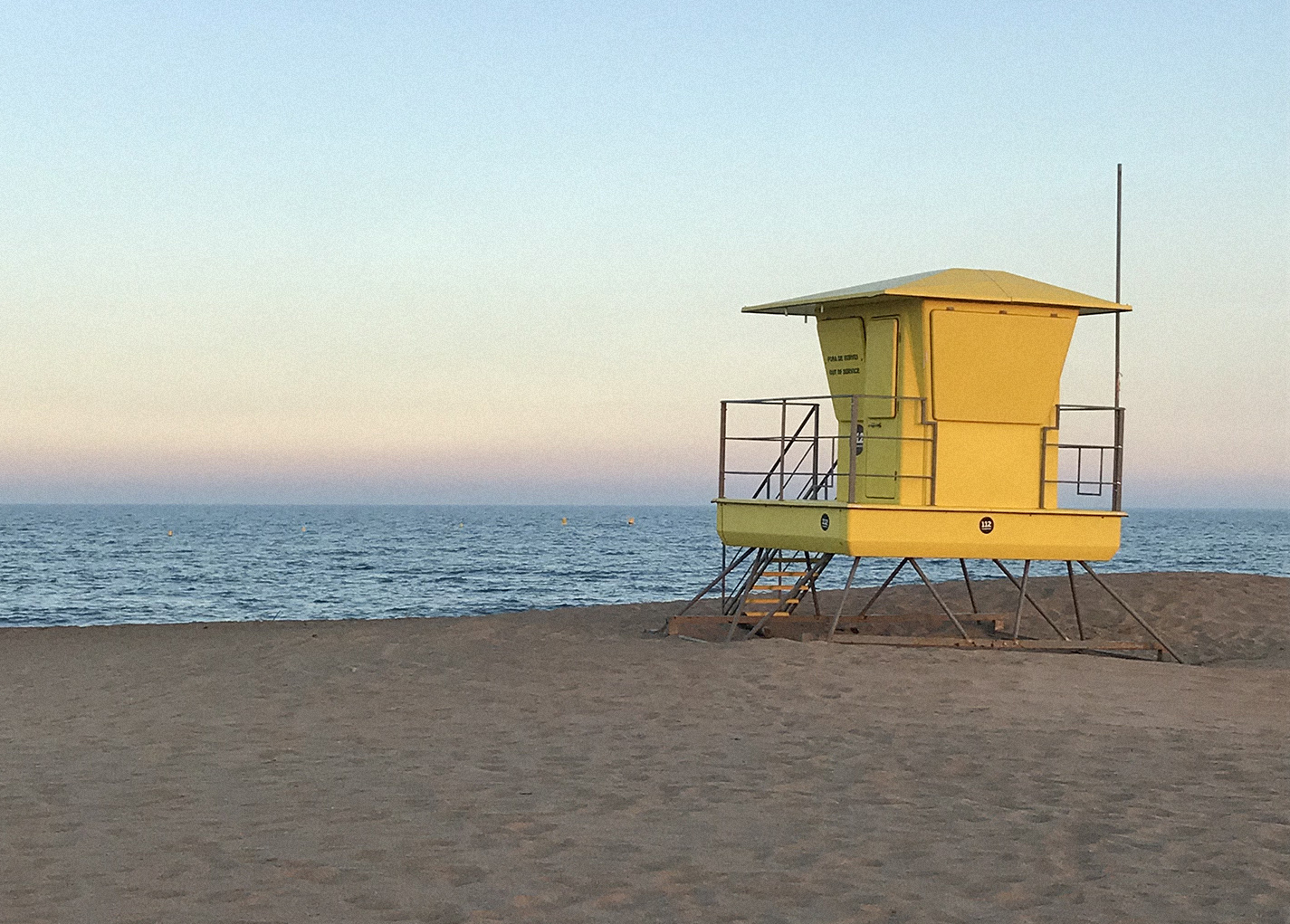
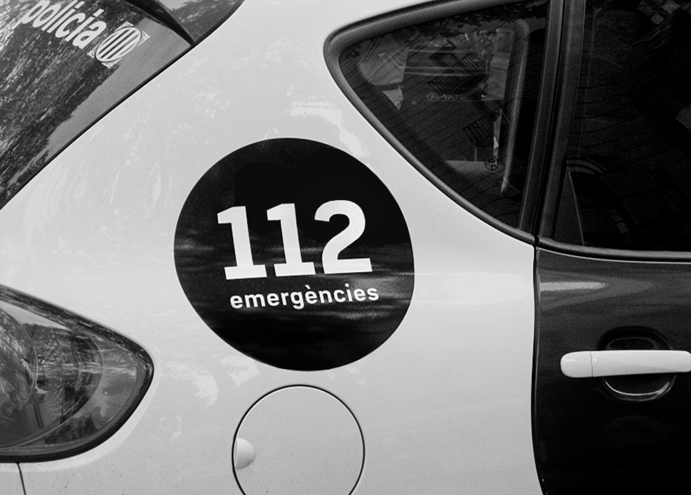
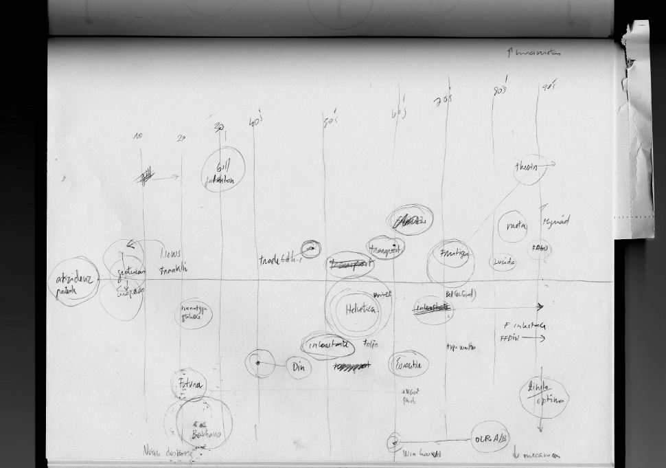
During the process of documenting the project, the most used typographic standards in the area of signage were studied, based on this documentation, different options were sketched and developed, which were tested and evaluated. The option chosen and finally developed expresses clarity, seriousness, confidence and a cold and technological feature that will define the new identity of this service.