We designed Eina as a corporate typeface for EINA, University Center of Design and Art. It is more than a functional font – Eina embodies an educational concept that transcends simple typographic use. Eina is a typeface with teaching potential, a way to learn about typography. On this page, you'll find an excerpt of the publication Four Nuances of a Typographic Standard: A Typeface for EINA, which includes Iñigo Jerez's reflections on the project, as well as a technical overview of the working process. This publication is currently out of stock, but, you can purchase the type here!
The assignment: drawing the lettermark
The new identity that Clase designed for EINA is no ordinary logotype. It isn’t simply a group of letters composed in a specific way based on an idea, but a graphic system whose meaning and functionality are a metaphor and an expression of the school's spirit. The logotype functions as a neutral frame, a flexible and dynamic container that defines a space where the school's different communication materials can be expressed with aesthetic independence. Both the concept of a frame, and its flexibility and neutrality, are the distinctive elements that informed the design of the new lettermark.

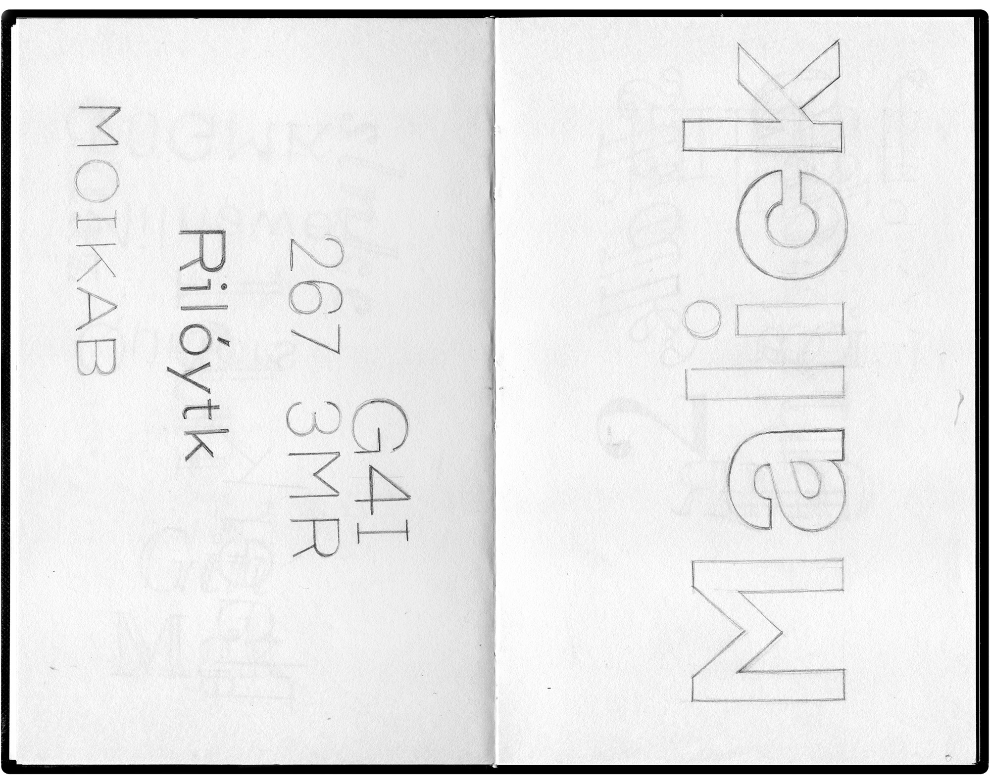
Clase initially asked me to draw the four letters of the new logotype. This process would define the aesthetic connotations and the brand expression, as well as the formal adjustments that were necessary to adapt the logotype to its particular function as a container and a monogram. I decided against decorative elements from the outset. Early sketches quickly evolved toward cleaner and more neutral standards. Following an initial assessment, I decided to compose the lettermark in uppercase, because the structure was more solid than lowercase and therefore functioned better as a frame. I also opted for a sans serif without contrast to tone down expressivity as much as possible. Finally, the mark needed significant weight to ensure good visibility.
Under this premise – and keeping in mind that the characteristics of the logotype's four letters meant working with only the most basic variables (width, weight, contrast) – the initial drafts inevitably brought to mind many typefaces that already existed. It was a clean and impersonal combination that captured the basic characteristics of the first sans serifs of the early twentieth century.
Solving a problem leads to a new project
The design of the new logotype was meant to solve a very specific lettering problem. In order for it to function as both frame and monogram, the weight of the four letters had to be balanced. In addition to adjusting ENA to make the letters equal in width, the design had to visually compensate for the lightness of the I. The solution was to add serifs. This brought the entire design into balance, and the lettermark worked as intended across all applications. However, the serifs on the I made the logotype a hybrid that combined incompatible criteria from a traditional standpoint: three sans serif letters sharing the same space with one serif letter.
Adding ball terminals to this particular letter solved the problem, and the unusual nature of it added character and identity, but I did have my doubts. Can such an unusual I and three such conventional letters share the same space? Could I establish a relationship between the structure of these four letters and the unique attributes of the serifs? Could I come up with a reason that would explain this combination of elements? The need to resolve a seemingly formal issue led to a new project: the design of a new type system that complemented the identity and would justify the use of serifs in the logotype.
The identity, the system, and the new type family
A «static» typeface didn't make sense within the context of the new identity. Much like the new lettermark, the type design project proposed a system, a type family that was «different,» not so much in terms of form – where the emphasis is on usability – as in its concept and organization. Eina came about as a useful complement in line with the new corporate identity, but it has a character and significance of its own. Its potential and value as a typographic identity lie in its form and utility, as well as in its unique character. The project became a process where theory met practice; a reflection on the relationship between structure and detail, skeleton and ornament, common elements and identity-defining ones.
I was fortunate enough to teach, and learn, at EINA for more than twelve years, so I inevitably felt a personal connection to the project. It wasn't just another type, nor just another client.The most sincere and logical proposal would encapsulate and reflect my teaching experience at EINA, as well as in the field of type design in general, and this was something I could only express through my vision of typography and my personal methodology. Much of that experience is recounted in this document.

How to organize a hybrid type
It was a project born of necessity, a way of integrating this dissonant element into the greater system to which it belonged. The initial impulse was to design a new typeface that responded to the unusualness of the I. Early sketches showed that the letter’s serifs were well suited to an industrial-flavored style with ball terminals, whereas a range of variations could coherently coexist with the other three letters. So why settle for a single style? Would an industrial-looking type suffice in representing a place as diverse and complex as EINA? No, that much was clear. Creating a hybrid family could be the solution to integrating the I – a family that would include different styles within the same system, built on the same structure. And upon arriving at this conclusion: why not have these styles represent some of the most important milestones in the recent history of typography?
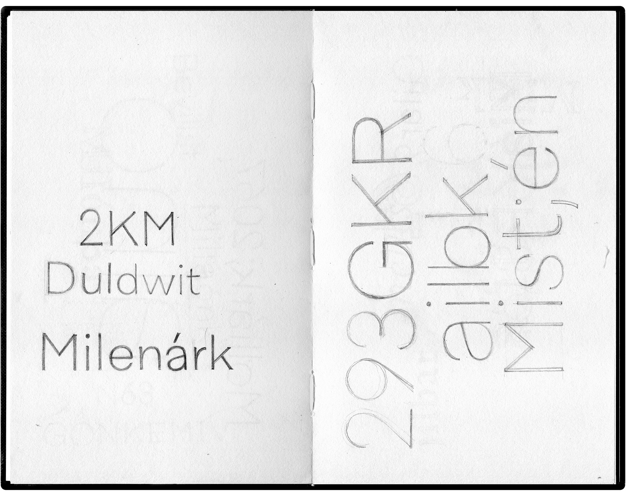
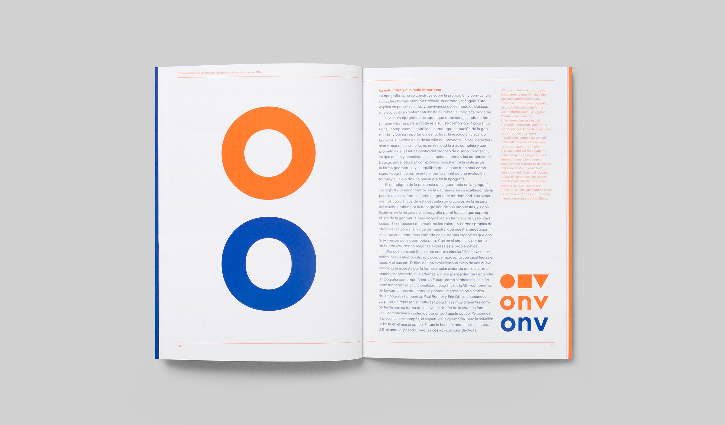
This idea evolved into a typeface project, because of another drawing, analogous to the lettermark, which emerged during the initial sketches. Here I substituted the four capital letters of the logotype with four minuscule a's, each finished with different nuances. And in the center is the o, the common denominator for the four corners. The placement of this one letter at the center of the drawing – and the project overall – is no coincidence. When designing a typeface, the o conditions and determines the structure of the other letters. We can design a type based on an unusual detail or a small distinctive feature, but we can't build it unless we have a well-organized structure. If the a-variations represent nuances and personality, the o stands for structure.
The idea behind the new Eina is that the four capital letters comprising the logotype each reflect a different style. In other words, each corner of the lettermark represents a nuance. In addition to justifying the unusual I, the stylistic diversity of the type family enhances the project with metaphoric value. The new Eina is diverse, pluralistic, open. It looks to the past – the recent history of typography – from a contemporary and functional perspective.
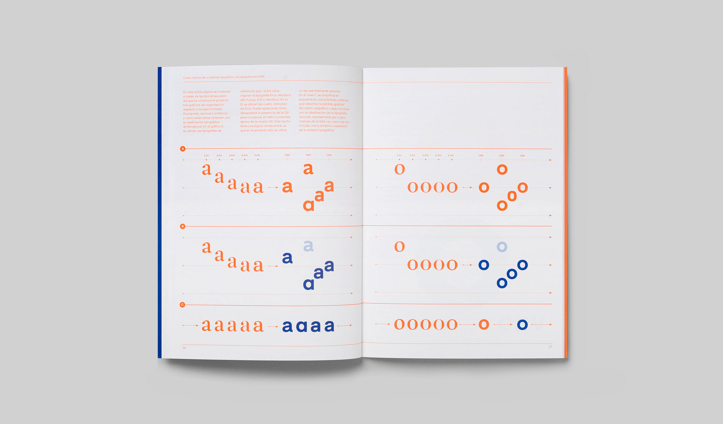
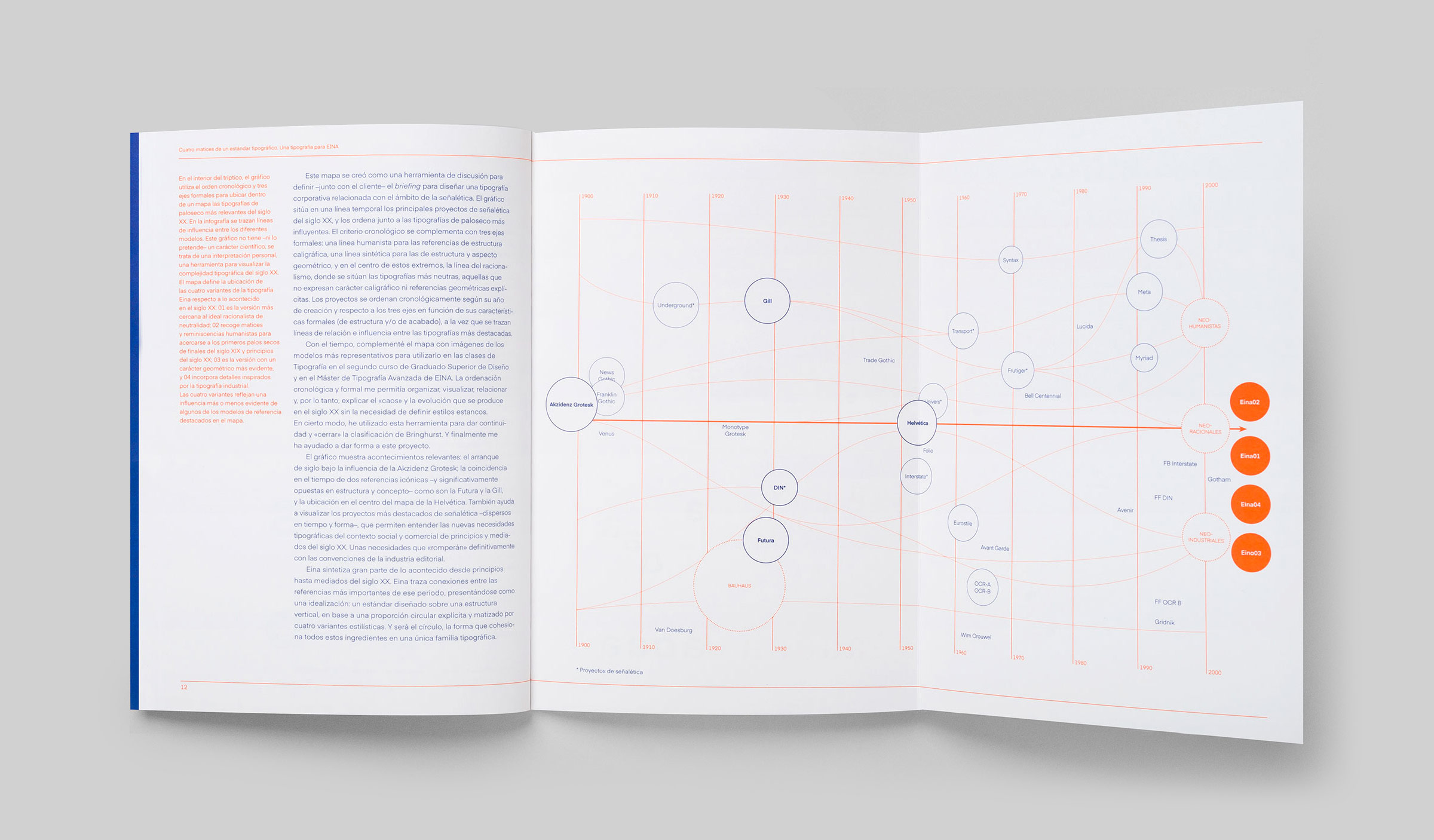
Eina expresses many of the most influential, twentieth-century typographic references on two levels. The first level is the structure: designed as a standard and built around the letter o. The letter, with its circular appearance, crystallizes some of the defining aspects of the leading type trends of the early twentieth century, the result of typography's formal evolution from the Renaissance to the mid-twentieth century. This process is characterized by the loss of calligraphic vestiges, the consolidation of a rational structure on a vertical axis, the homogeneity of horizontal proportions, and the absence of contrast.
The nuances comprise the second level: the four variations designed around the characteristics of the letter a express, more or less explicitly, some of the most important categories in recent typographic history: rational (Eina01), humanist (Eina02), geometric (Eina03), and industrial (Eina04).