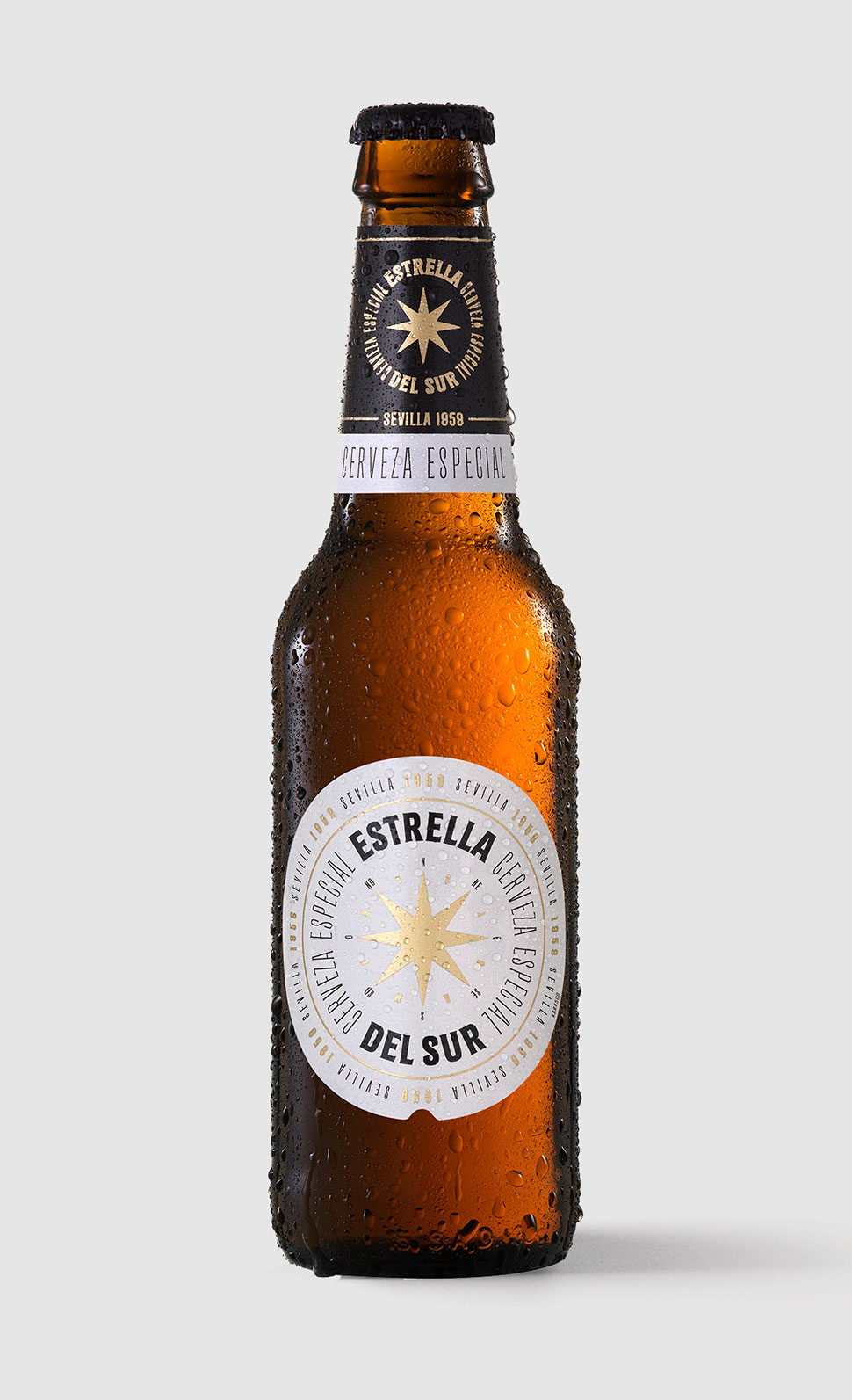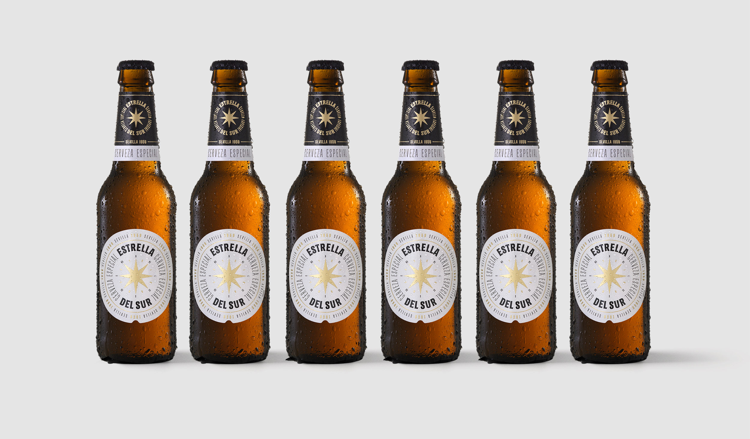
A set of characters for the packaging of Estrella del Sur Especial, co-designed by Extra! and Xavier Bas Disseny for Grupo Damm's new premium beer aimed at the Andalusian market. The technical complexity of the label demanded a solution that would enable meticulous micro-typographic adjustments while facilitating workflow. With this in mind, we designed a custom set of characters that allowed us to adjust every typographic element on the label. The working process involved a combination of lettering through an interplay of variables like condensation and contrast, allowing us to shape the tone and expression of the type while adapting it to the needs of the medium. The resulting typeface takes inspiration from details of nineteenth-century urban wall inscriptions; a typeface that reaches beyond the label, expressing, with different degrees of weight and condensation, the flavor and personality of the product.