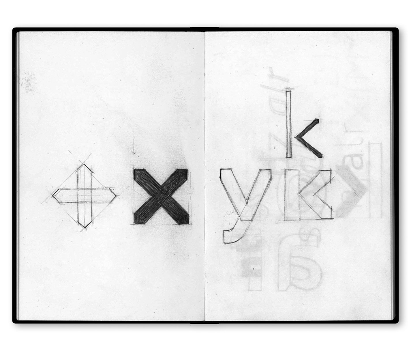
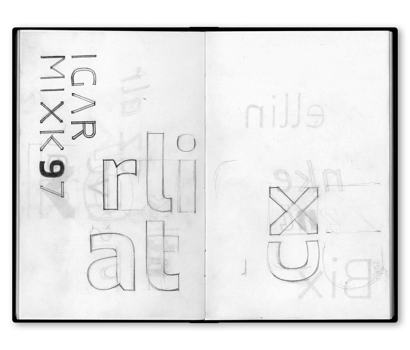
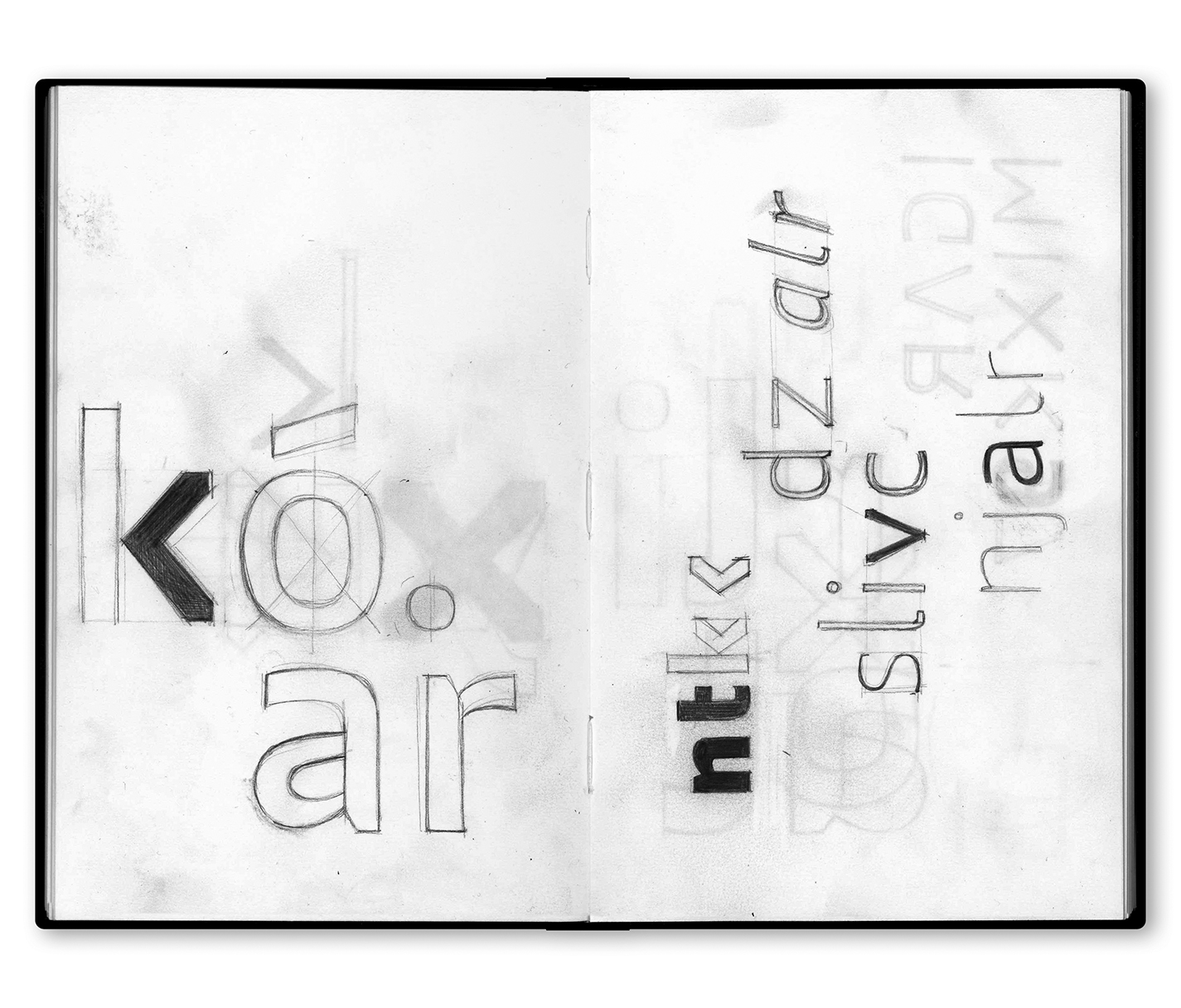
A corporate typeface for CatalunyaCaixa. The project called for a new logotype and symbol, part of a bigger rebranding project designed by Clase. The drawing of the logotype informed the development of an extensive type family to be used in all corporate communications. The brief asked for a style with technological overtones that projected a composed, modern image. Our response was a sober typeface, solid and compelling in the heavier weights, clear and functional in the lighter weights. The rational, lightly condensed, quadrilateral structure stands in contrast to the wide aperture, which gives the design a clear, welcoming appearance. The project contains a «secret» reference to the brand's previous identity: the cross of St. George. This particular element takes a 45-degree turn to become an X, part of the acronym CX, which is short for «caixa» and also functions as its identifying symbol. This characteristic informed the use of vertical edges on the diagonal letters, which defines an essential aspect of the typeface's unique personality. We developed the family's scope and organization based on an in-depth analysis of the brand’s communication needs and designed it to cover a wide range of applications. CX consists of three weights with italic versions, and light and ultra weights for display uses.