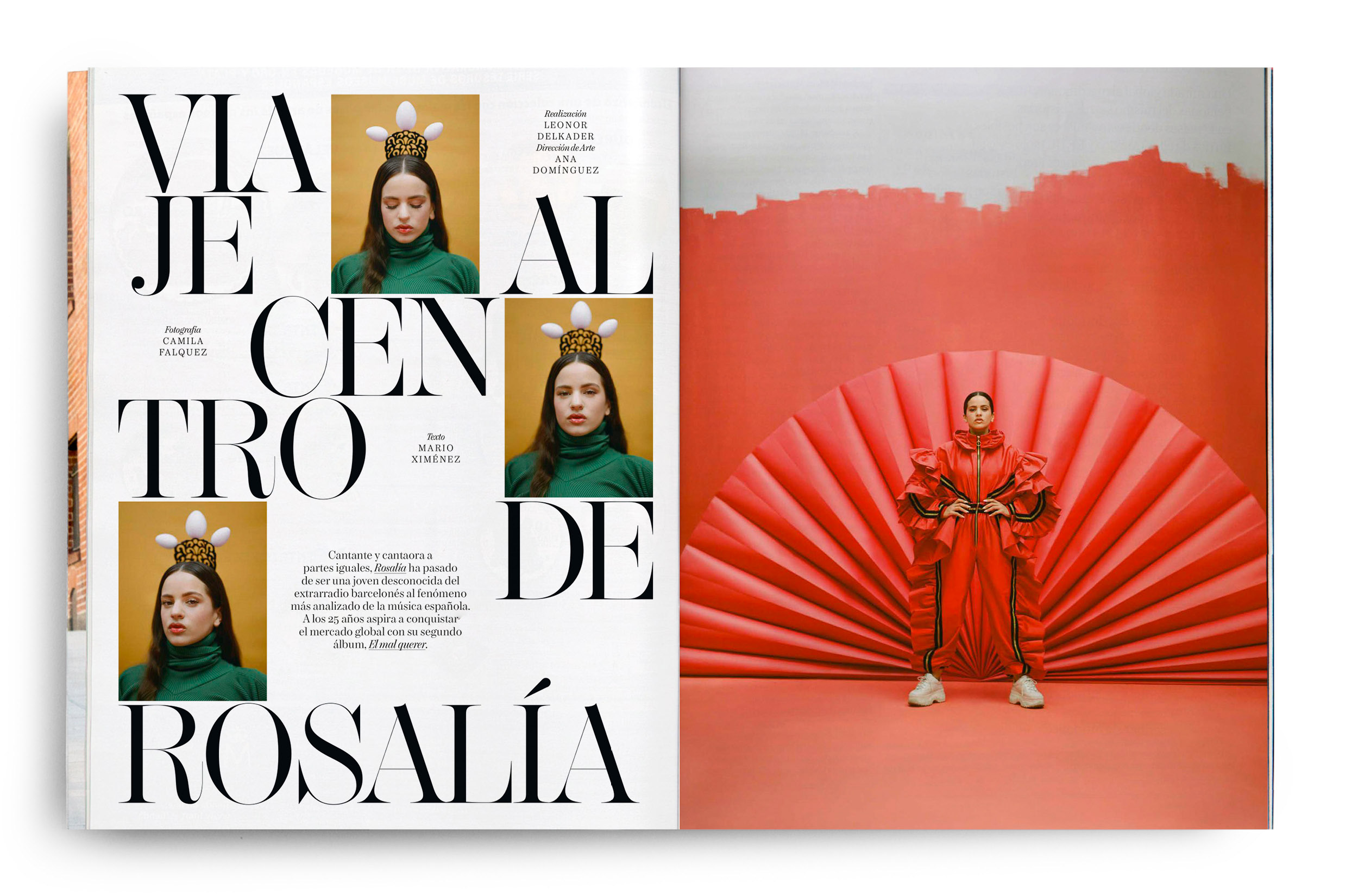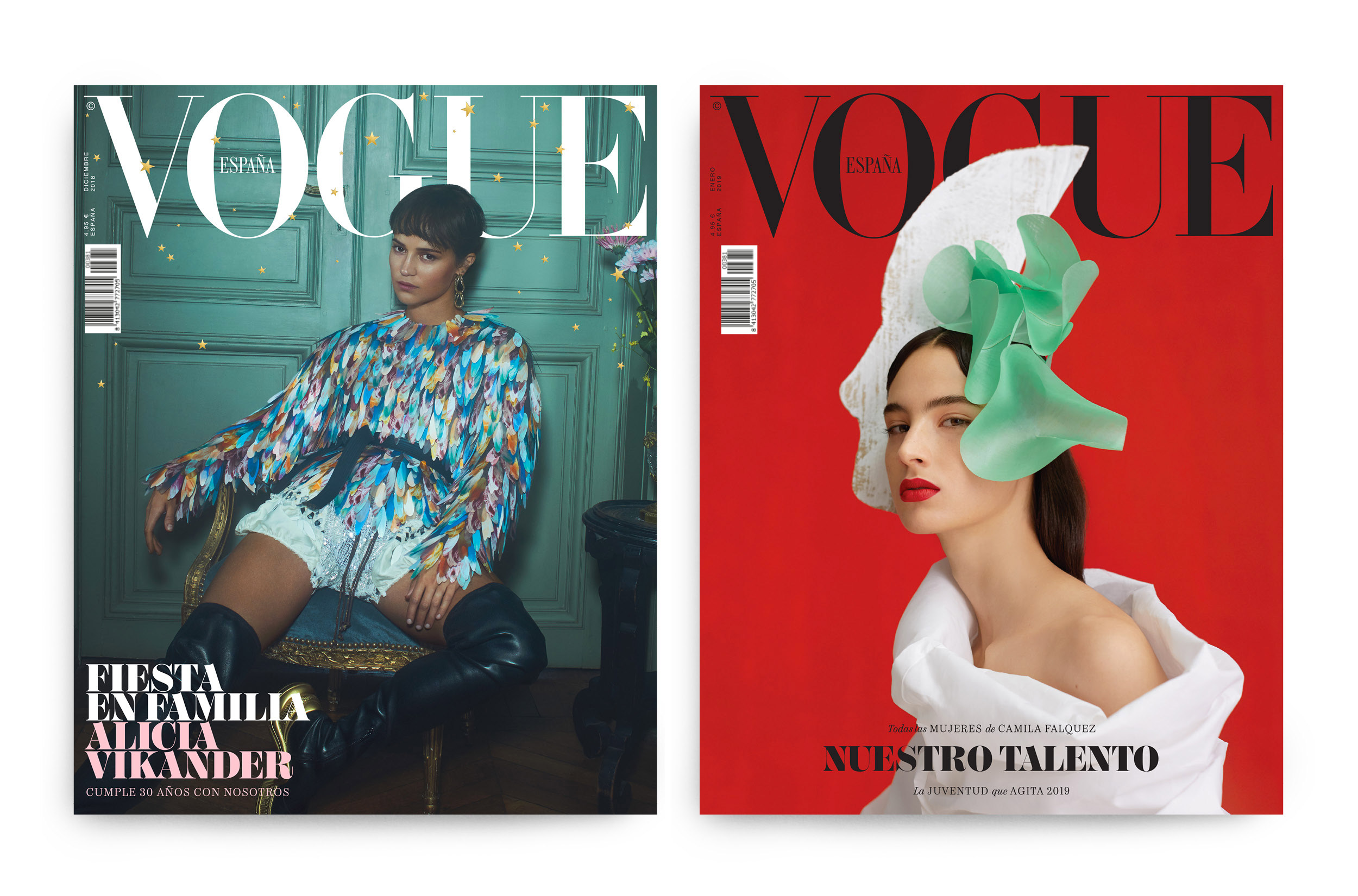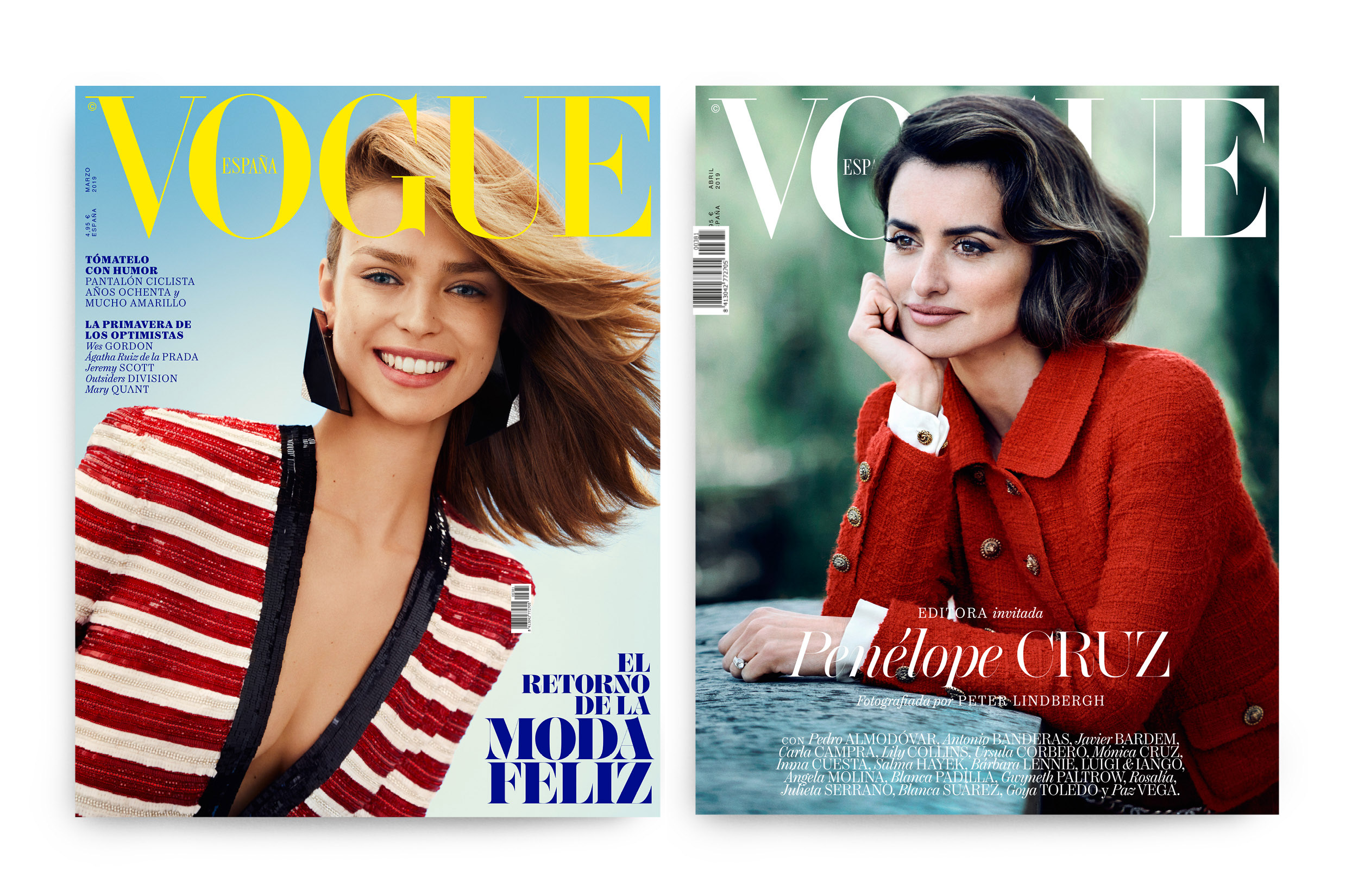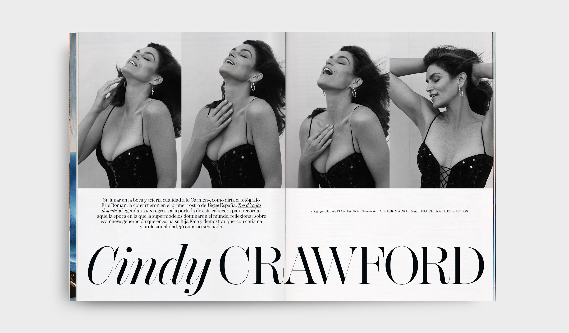

How should a typeface for Vogue's Spanish edition be? One of the many possible answers to this question is Chamberí, which, as much as any custom typeface, is defined by how it meets the errand demands and how it technically solves them. It’s thus a matter of choosing an answer and designing a working process accordingly, in order to get the best possible outcome. The topic is fashion, hence the concept is beauty and its relation with functionality, a broad and ravishingly subjective notion, bound in this case to a territory. What is, therefore, Spanish beauty? Clearly, there is no single answer, so which one can we hold on to?
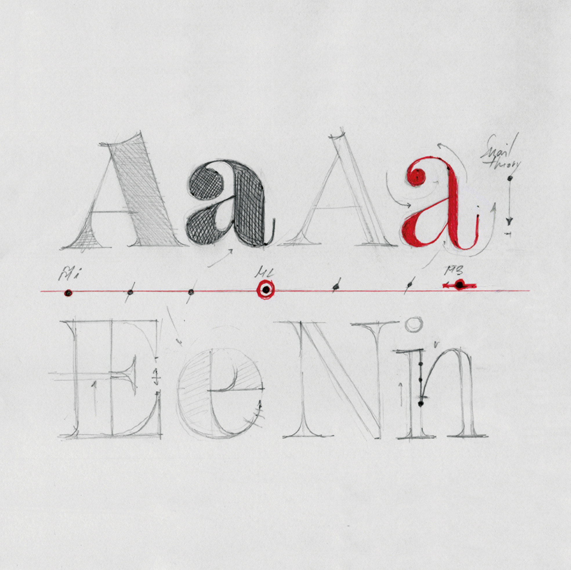
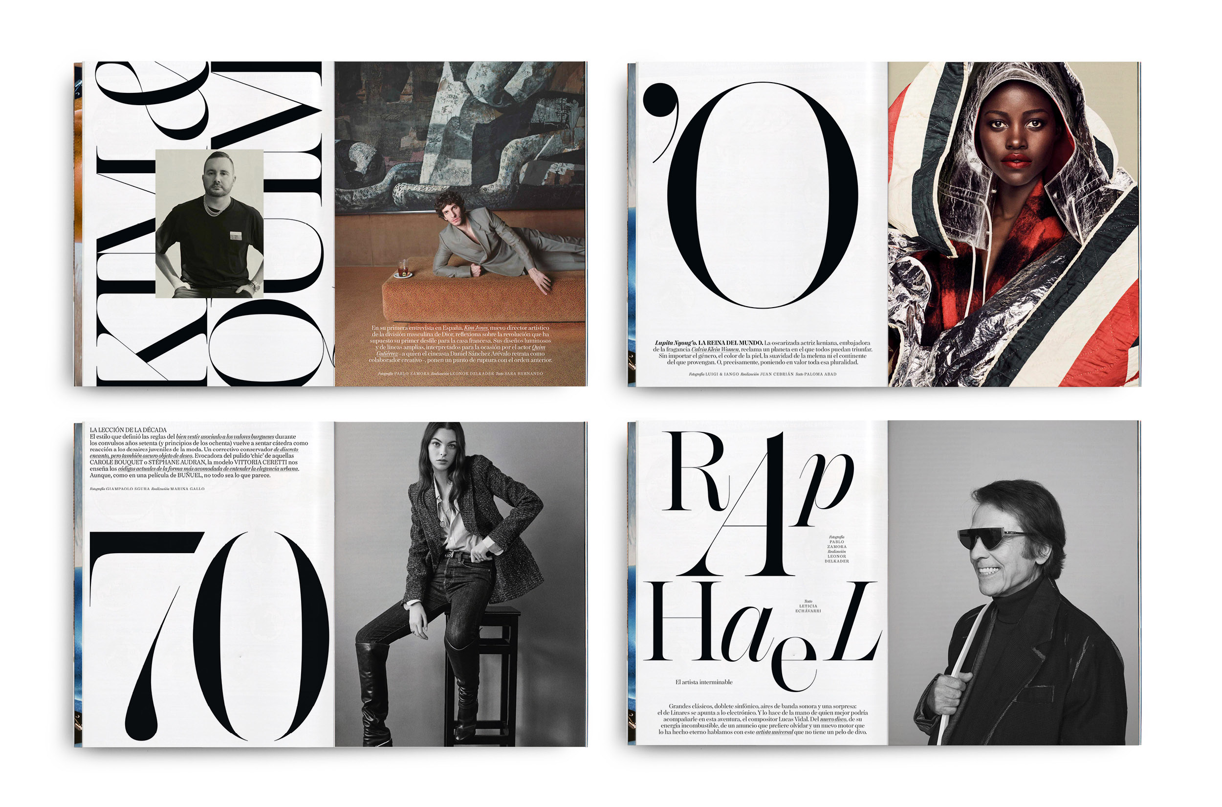
Typography as a convention relates very well to clichés. A text typeface’s conceptualisation works when it follows generic structural ideas and details are used to model and module these ideas. The answer Chamberí offers springs from a rather simple idea: refining the vulgar as much as possible to exalt beauty, sophisticate the functional and push it to the limit by opposing a rational structure to the exaggeration of some details and gestures. Where does the limit of this contrast sit? The limit appears when, while drawing a question mark, one can catch a glimpse of the silhouette of a Flamenco dancer, or when thinking that mixing two different axes in a “g” can have something to do with the chaotic idiosyncrasy that tells the “Spanish” apart from the rest of the world. The interesting part is the cliché being present yet unnoticeable, the limit rests in subtly brushing the folklore.
How can we achieve different levels of expressiveness within the same family? How to stress this expressiveness without losing functionality? The answer lies in the “Snail Theory”: this theory conveys into vectorial drawing a shape modulation technique using the same approach as the snail: pulls out the horns when it’s happy, retracts them when it want to stay concealed. Chamberí is restrained in text and much more expressive in its Display cuts. What is interesting is that this difference perfectly fades across variants through interpolation. This cloaking effect, so evident in straight shapes and serifs, converts into something more complex and sophisticated when dealing with curve strokes. Here, the theory is solved by hiding the shape in the inner part of the terminals and organising the drawing in order to gradually let it out as the contrast increases. Chamberí has been a technical challenge, but its resolution has turned a struggle between extremes into its signature feature.


Lastly, the working process: Chamberí has been developed jointly to Oscar Germade, Art Director of Vogue España. Along its different work phases, it has been tested and tweaked up until the final result. It is therefore a project tested in the most demanding context possible, designed to answer each and every editorial need of the magazine. You can buy chamberí by clicking here.