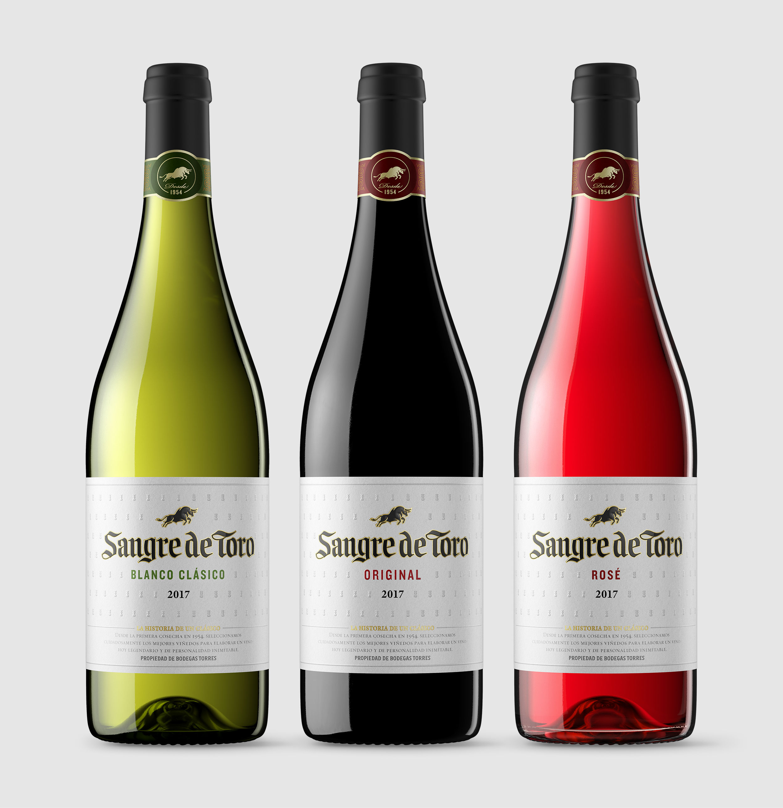
Logotype design for Sangre de Toro, one of the most iconic and international Spanish wines produced by Bodegas Torres. The product has been around for over 60 years and is sold in over 140 countries. Extra! oversaw the redesign, which recovered some of the product's historical elements in a clean and contemporary formal concept. The design of the logotype reinterprets the original gothic typeface, adapting its spacing, weight, rhythm, and details to work within the context of a label. The result softens the brand, making it more accessible without losing its original spirit and strength.