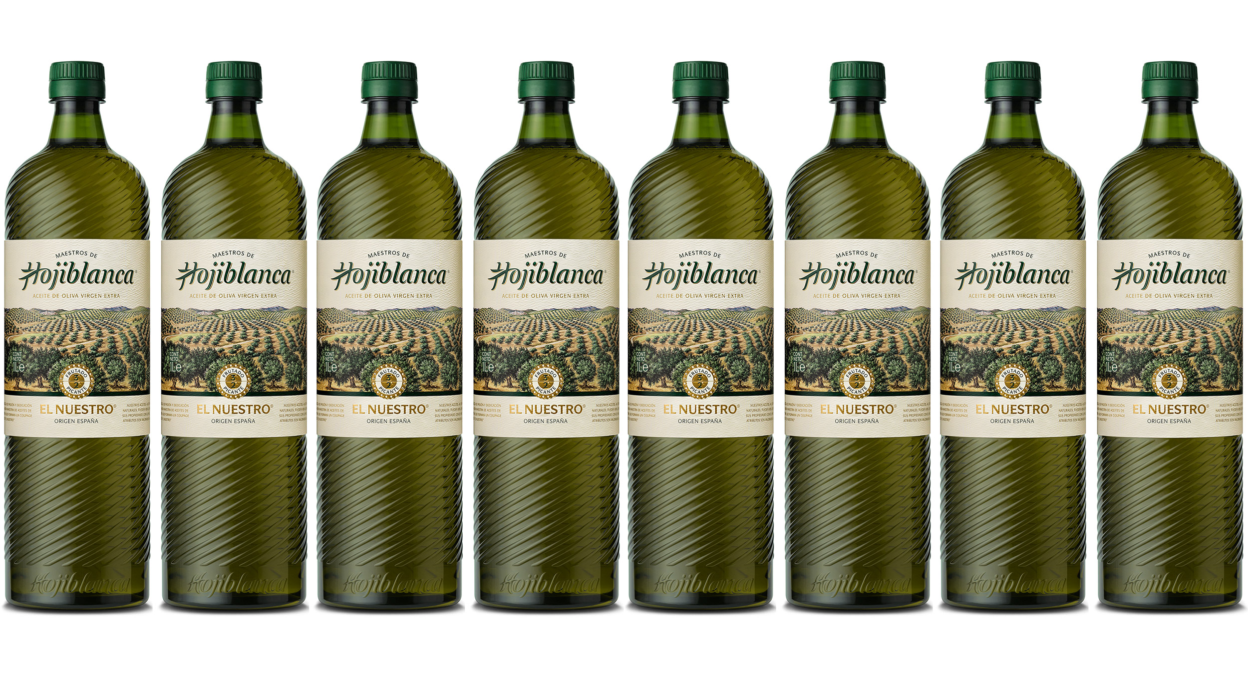
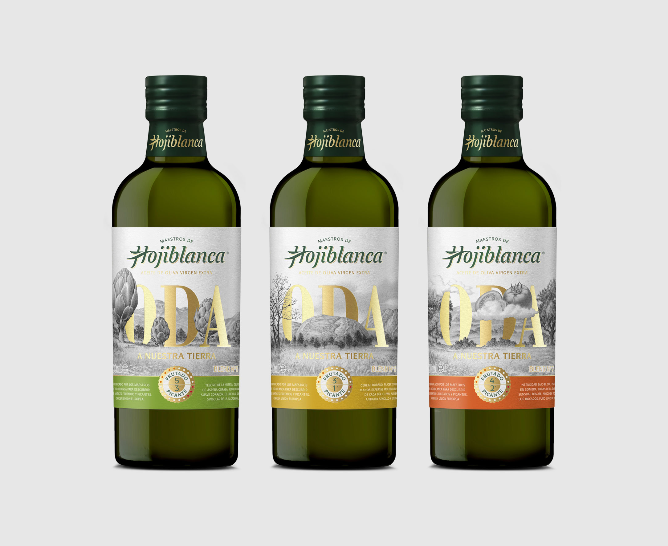
Dorian commissioned us to redesign the logotype of Hojiblanca, a company owned by Deoleo group, a world leader in bottled oil. The starting point for the project was the original iconization of the brand's first letter, from which we created a new concept, coherent with its origins, but more appealing and consistent as a logotype. During the working process, we explored a range of alternatives, from typographically conventional options to more open, fluid and dynamic proposals. We tested the different versions to see how they fit within the graphic context of the new packaging line developed by Dorian. The option we ultimately chose integrates the iconic capital into a type style that subtly evokes the organic and fluid nature of oil, adjusting all formal aspects to make it work as both a generic wordmark and in packaging applications.