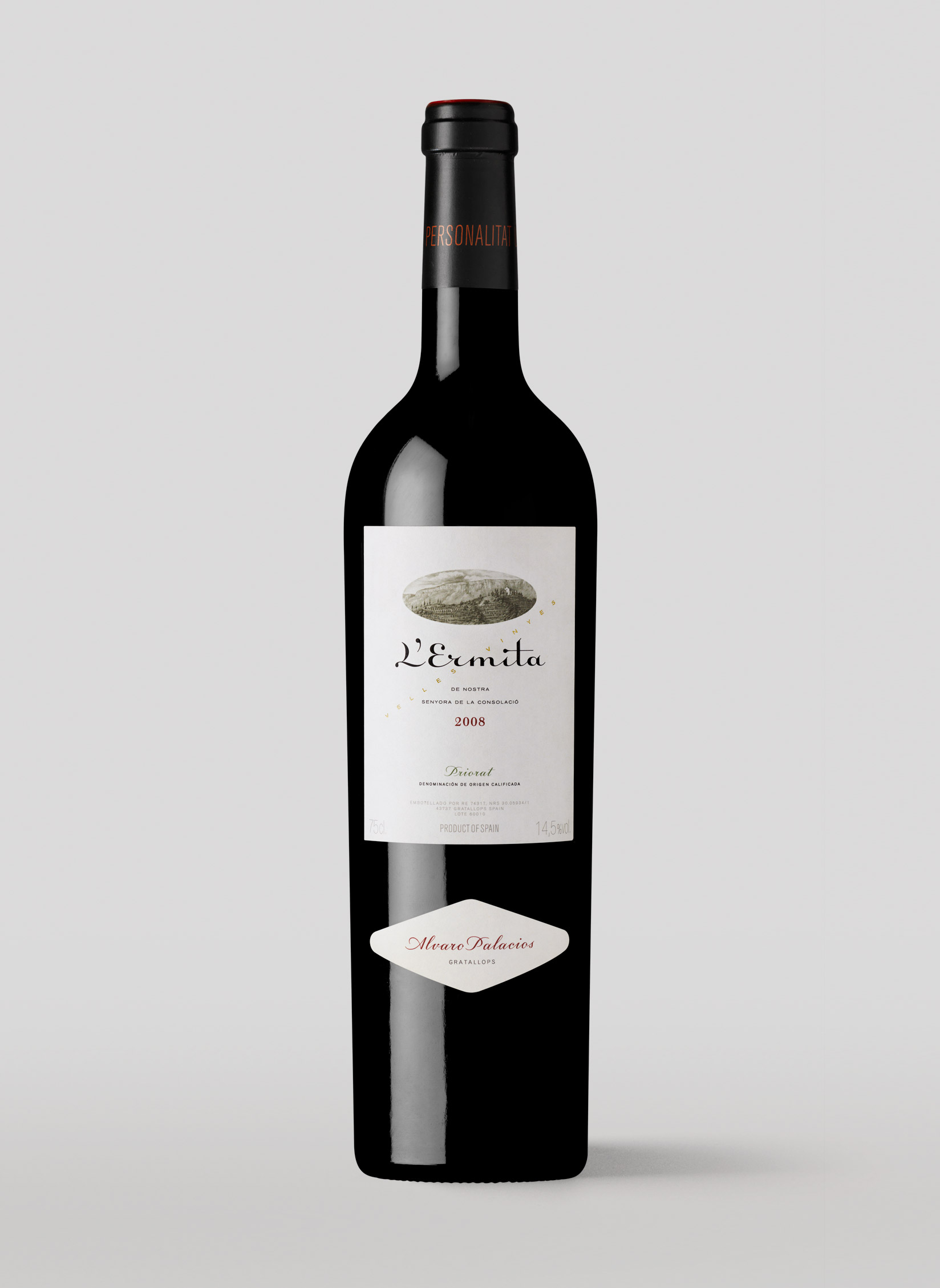
In 1989, Álvaro Palacios headed to Priorat to prove that he could produce top-quality estate wines in what was then an up-and-coming wine region. Not only did he succeed, he created a cult wine: L’Ermita, the wine that introduced the world to llicorella schist, Priorat Garnacha, and the old vineyards around Scala Dei. The logotype for this classic label designed by Xavier Bas proposes a subtle yet conspicuous change to the label originally composed in Linoscript, a typeface with connecting letterforms and an upright italic structure, designed by Morris Fuller Benton in 1905. The new wordmark stays true to the original spirit, but lightens and simplifies the relationship between the capital letters and the apostrophe, reorganizes the spacing, and improves the details of the drawing, which includes an explicit reference to the brand's meaning in the unusual ligature of the i-dot and the cross stroke of the letter t.
