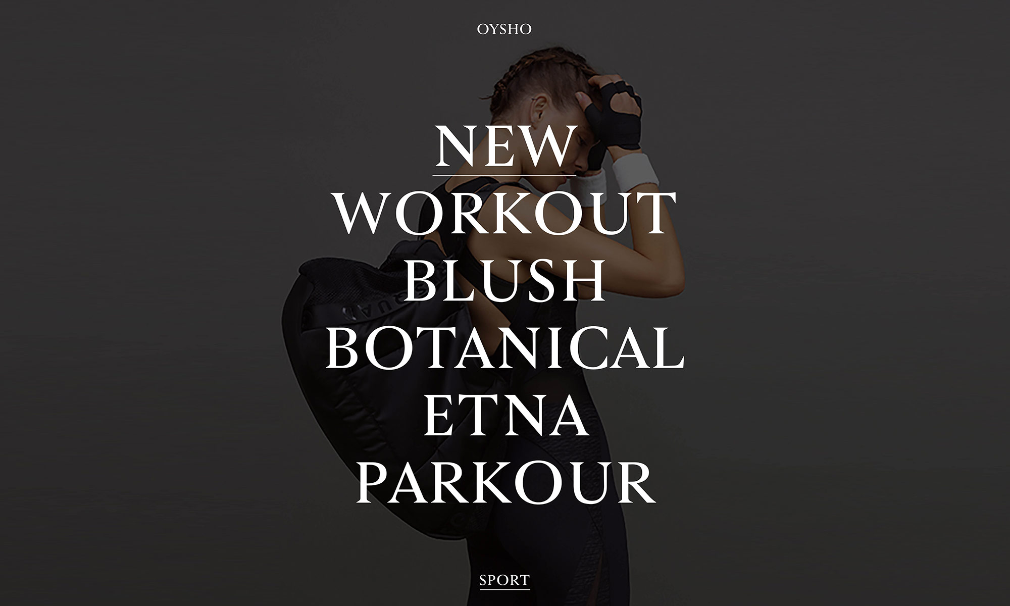
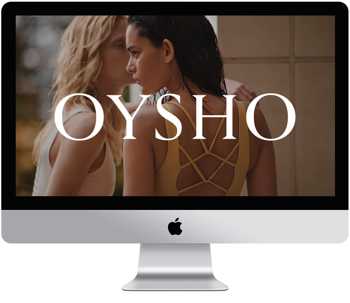
Lettering for the redesign of the corporate identity of lingerie and underwear brand Oysho, which has over 400 stores around the world and is owned by the Inditex group. We developed the project in two stages, which corresponded to a change in the brand's direction, aimed at a more feminine, diverse and organic universe with a wide range of consumer profiles.
We worked with Extra! on the first stage. The changes to the logotype reflect the new visual identity: the Roman capital –sober, delicate, timeless– connects with a lifestyle based on mixing it up and reinvention, on the connection between old and modern. For this project, we drew the logotype in three levels of thickness and contrast so that the brand could adapt seamlessly to the various applications of the visual identity system: in stores, packaging, and digital media. We collaborated with Clase on the second stage, which involved hardening the logotype ever so slightly to pave the way for a catalog expansion where the brand had to be contextualized for technical and athletic wear.